
Census 2010 Participation Rates
Geodemographic Analyst, Indiana Business Research Center, Kelley School of Business, Indiana University
This summer, Census workers have been in the field, going door-to-door following up on households that did not return their census form by mail (a procedure known to census junkies as non-response follow-up). Given that high mail participation rates are correlated with more accurate data and lower costs, it is good to note that Indiana had one of the highest mail participation rates in the nation and many areas saw improvement relative to Census 2000.1
States
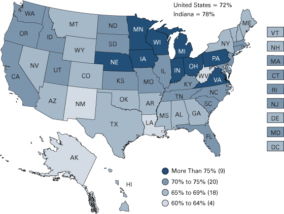
Indiana tied with Iowa for third in the nation with a mail participation rate of 78 percent. The national rate was 72 percent, with participation ranging from 62 percent in Alaska to 81 percent in Wisconsin (see Figure 1).
Figure 1: Census 2010 Mail Participation Rate by State
Source: IBRC, using U.S. Census Bureau data
Nationally, the 72 percent participation rate showed no change since Census 2000. At the statewide level, Indiana saw a 2 percentage point increase in participation over Census 2000. It was one of twenty-one states to see rates improve compared to the last census. North and South Carolina showed the largest improvements, with rates increasing by 8 percentage points. On the flip side, Wyoming saw a 4 point decline in participation.
The Census Bureau released rates on a daily basis to allow local officials to track their participation during March and April. Figure 2 shows that while Indiana had higher rates overall, the basic mail-back trend mirrored the nation.
Figure 2: Daily Mail Participation Rates, March 23–April 28, 2010
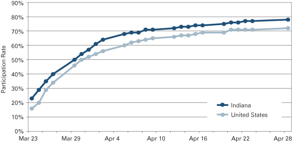
Note: Data were only released Monday through Friday and the Census Bureau did not release data between April 24 and April 28. Hash marks indicate every two days.
Source: IBRC, using U.S. Census Bureau data
Counties
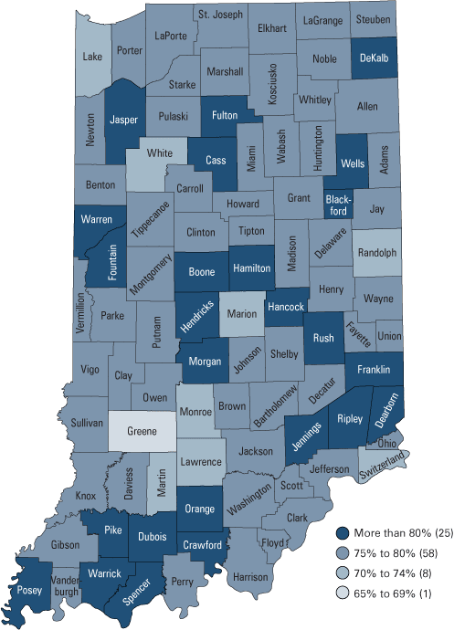
Within Indiana counties, participation ranged from 67 percent in Greene County to 86 percent in Dubois County (see Figure 3).
Figure 3: Census 2010 Mail Participation Rate by Indiana County
Source: IBRC, using U.S. Census Bureau data
Fifty counties saw increases over Census 2000, led by Crawford County with a 19 percentage point gain (for a 2010 rate of 81 percent). Five counties (Crawford, Owen, Jennings, Pulaski, and Switzerland) saw increases of 10 percentage points or more. White County saw the largest drop in mail participation between the decennials, moving from 77 percent in 2000 to 71 percent in 2010.
Cities and Towns
The tiny town of North Crows Nest (population: 44) in Marion County boasted a 100 percent participation rate. At the other end of the spectrum, the town of Macy (population: 228) in Miami County had the lowest rate in the state at 38 percent.2
Table 1 focuses on the 20 largest cities and towns in the state, showing Carmel with the highest participation (85 percent) among this group. Compared to 2000, eleven of the twenty areas saw increases in their participation, led by Terre Haute, which picked up 3 percentage points since the last decennial. Among all 566 incorporated places in the state, Indiana saw 289 out of 566 with higher rates compared to Census 2000.
Table 1: Census 2010 Mail Participation Rate for Indiana’s 20 Largest Places
| City/Town | 2010 Participation Rate | Change from 2000* |
|---|---|---|
| Carmel | 85% | 1% |
| Fishers | 84% | 0% |
| Noblesville | 81% | 1% |
| Columbus | 78% | 0% |
| Fort Wayne | 77% | 2% |
| Lafayette | 77% | -1% |
| Mishawaka | 77% | 0% |
| Greenwood | 77% | -3% |
| Kokomo | 77% | 1% |
| Terre Haute | 76% | 3% |
| Evansville | 75% | -3% |
| Anderson | 75% | 2% |
| South Bend | 74% | 1% |
| Muncie | 74% | 2% |
| Indianapolis | 73% | 2% |
| Lawrence | 73% | 1% |
| Elkhart | 71% | 2% |
| Bloomington | 70% | 0% |
| Hammond | 68% | -3% |
| Gary | 67% | -2% |
*Indicates percentage point change
Source: IBRC, using U.S. Census Bureau data
Tracts and Townships
Census tract and township data help us look closer at individual areas since participation can vary significantly within a city or county. Tracts are useful for looking at urban areas, while townships are useful for more rural areas. (Tracts are delineated based on a rough population threshold; therefore, they are significantly smaller than townships in urban areas, but can become quite large in rural areas). Interactive maps showing participation rates for both geographies are available on Indiana’s Census 2010 website: www.census.indiana.edu.
Prior to the census, the Census Bureau developed a hard-to-count score, which assessed how tracts performed on twelve variables correlated with high non-response rates. Scores can range from 0 to 132, with 0 being the easiest to count and 132 being the hardest to count. Tracts with scores above 70 were classified as hard to count. Out of 1,409 tracts statewide, Indiana had 125 classified as hard to count. These were concentrated in urban areas across sixteen counties, but over half (54 percent) of the hard-to-count tracts were in Marion and Lake counties.
Table 2 shows that the average participation rate declined for each grouping on the hard-to-count continuum. The interesting take-away from this table is that the hard-to-count tracts saw a 4 percentage point increase over Census 2000 participation, larger than the change in any other group. This indicates that efforts to target hard-to-count areas were indeed successful.3
Table 2: Average Mail Participation Rate by Hard-to-Count Score
| Tract Group | Number of Tracts | Average of 2010 | Average of 2000 |
|---|---|---|---|
| Total | 1,409 | 76% | 75% |
| 1 to 10 (Easy to Count) | 548 | 82% | 81% |
| 11 to 20 | 226 | 77% | 77% |
| 21 to 30 | 160 | 76% | 76% |
| 31 to 40 | 108 | 75% | 74% |
| 41 to 50 | 110 | 73% | 72% |
| 51 to 60 | 60 | 70% | 69% |
| 61 to 70 | 72 | 66% | 65% |
| 70+ (Hard to Count) | 125 | 63% | 59% |
Source: IBRC, using U.S. Census Bureau data
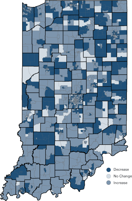
In fact, while only 48 percent of all tracts improved their performance over Census 2000, 71 percent of hard-to-count tracts saw increases in their participation rates (see Figure 4).
Figure 4: Percentage Point Change in Participation Rate by Tract, 2000–2010
Source: IBRC, using U.S. Census Bureau data
Figure 5 plots the hard-to-count score for all of Indiana’s tracts against their 2010 participation rate. There is a correlation between high hard-to-count scores and lower participation rates, though one can see that several tracts that were not deemed hard-to-count had relatively low participation rates (i.e., 70 percent or below). Many of these were located in the less urban areas of the state.
Figure 5: Relationship between Hard-to-Count Score and 2010 Participation Rate for Tracts
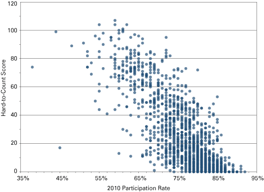
Source: IBRC, using U.S. Census Bureau data
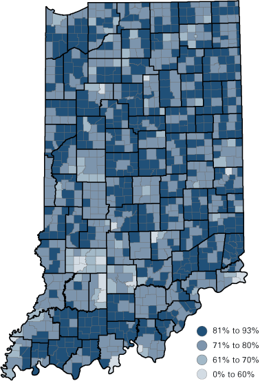
Figure 6 shows mail participation rates by township. Rural areas had both some of the highest participation as well as some of the lowest participation. The cluster of low participation in Greene, Martin, and Lawrence counties is notable; this could be due to a variety of factors, such as large numbers of vacant housing in the area, but an exact explanation is unknown.4 It will be especially important for non-response follow-up to be successful in these areas.
Figure 6: Census 2010 Mail Participation Rates by Indiana Township
Source: IBRC, using U.S. Census Bureau data
Conclusion
Most Hoosiers did their part and mailed their census forms back before census takers began door-to-door canvassing. This both saved tax dollars and helped ensure Indiana is accurately enumerated. Across the state many areas saw participation rates improve over Census 2000, particularly in many of the traditionally hard-to-count urban areas. As Phase 2 of census data collection wraps up, visit www.census.indiana.edu for updated news and information.
Notes
- The participation rates used in this article are the rates released on April 28 and are the final rates prior to the cut-off for non-response follow-up operations. While the terms are often used interchangeably, participation rates differ slightly from response rates in that they exclude non-deliverable addresses from the denominator. For more information on the types of rates, see D’Vera Cohn, “New Measure of Participation in the 2010 Census,” Pew Research Center, March 11, 2010, www.pewsocialtrends.org/2010/03/11/new-measure-of-participation-in-the-2010-census/.
- Population numbers are the 2008 population estimates produced by the Census Bureau and are given only for reference.
- For example, the Center for Urban Research at the City University of New York notes that the Census Bureau’s replacement mailing strategy was quite effective nationally: www.urbanresearch.org/resources/census2010participationApril28.
- However, it is not likely due to the Census inappropriately trying to send forms to a physical address when the resident actually receives his or her mail at a P.O. Box because the participation rate omits those addresses where the form was undeliverable.