
Bloomington Forecast 2012
Director of Economic Analysis, Indiana Business Research Center, Kelley School of Business, Indiana University
Research Assistant, Indiana Business Research Center, Kelley School of Business, Indiana University
While many Midwestern cities suffered mightily over the last few years, the Bloomington metropolitan statistical area (MSA) has emerged from the economic downturn in comparatively good shape. The forecast for the Bloomington area is relatively bright.
The Bloomington area sustained considerable population growth between the 2000 and 2010 censuses. As a whole, the MSA’s population grew by close to 10 percent, roughly equivalent to the national average. As Figure 1 shows, this growth occurred entirely within Monroe County. In contrast, the combined population of Greene and Owen counties decreased by 203 people over the last 10 years. In the first half of the decade, the city of Bloomington lost population while the surrounding county gained. In the last five years, however, both the city of Bloomington and the rest of Monroe County have grown substantially. In the coming years, the county’s population is expected to continue this increase.
Figure 1: Bloomington Population MSA by Geography, 2000 to 2010
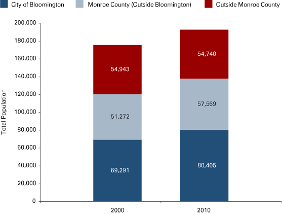
Source: IBRC, using U.S. Census Bureau data
The Bloomington MSA weathered the economic decline better than most other areas. In fact, according to the Bureau of Economic Analysis, the Bloomington GDP never declined—although its growth did slow. Estimates show Bloomington’s GDP growing by a scant 0.7 percent in 2010. Moody’s Analytics forecasts the same paltry rate of economic growth for 2011. For 2012, Moody’s forecasts a 1.6 percent rate of economic expansion.
Within the Bloomington MSA, different industries have experienced different patterns of growth. As shown in Figure 2, both the manufacturing and service-producing sectors have been steadily growing for more than 10 years. The service-producing sector did experience a significant drop in 2007 following a sharp increase, but has since made up most of the lost ground. Manufacturing output is at its highest level to date and is projected to continue the upward trend.
Figure 2: Gross Domestic Product by Aggregated Sectors, Bloomington MSA
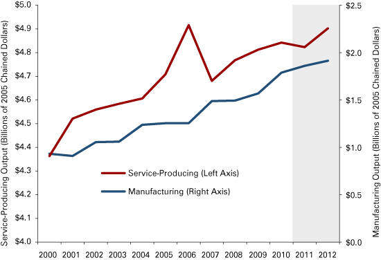
Note: Data for 2011 to 2012 are forecasts.
Source: IBRC, using Bureau of Economic Analysis data and Moody’s Analytics for forecast values
While Bloomington will likely register positive, if sluggish, growth in GDP for 2011, the forecast for employment is not as positive since job growth typically lags economic growth. Payroll employment in Monroe County peaked in 2008 at just over 83,000 (see Figure 3). Since then, it has steadily declined to 81,600 in 2010. Unfortunately, projections for future employment are negative, with 2012 employment projected to fall below 80,000.
Figure 3: Monroe County Total Employment, 2000 to 2012
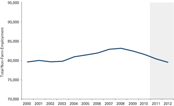
Note: Data for 2011 to 2012 are forecasts.
Source: IBRC, using Bureau of Economic Analysis data and Moody’s Analytics for forecast values
Figure 4 shows how the employment base has changed over the last few years. Manufacturing and retail trade have both declined gradually throughout the decade, with manufacturing employment experiencing a sharp dip in 2009. The three industries that have maintained and even boosted Monroe County’s total employment are 1) educational services, 2) health care and social assistance, and 3) professional, scientific, technical services and management of companies. Proprietor employment also grew at a faster clip than total employment.
Figure 4: Industries in Monroe County with Notable Employment Gains and Losses, 2001 to 2009
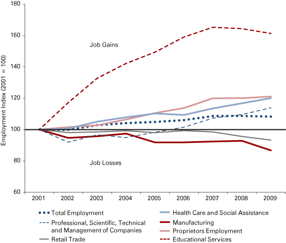
Source: IBRC, using Bureau of Economic Analysis data
The average personal income of Monroe County residents has historically lagged the averages for both Indiana and the United States. As Figure 5 shows, however, Monroe County’s average personal income has risen steadily since 2001, faster than either Indiana’s or the nation’s. In 2009, Monroe County made substantial ground as its average personal income rose slightly while Indiana and the U.S. average dropped precipitously. Even so, adjusted for the lower cost of living in Indiana—about 93 percent of the national average—Indiana and Monroe County still lag the U.S. average in per capita personal income (PCPI).
Figure 5: Per Capita Personal Income, 2000 to 2009
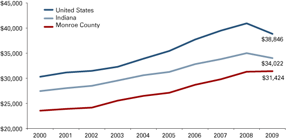
Source: IBRC, using Bureau of Economic Analysis data
Perhaps encouraging is the fact that for the year 2009, Monroe County was growing faster annually than either the United States or Indiana in terms of PCPI. From 2000 to 2008 the average annual rate of growth for current dollar PCPI in the United States was 3.5 percent. Monroe County’s annual average rate of PCPI growth was 3.3 percent for the same period. Figuring in 2009, however, adversely affects the U.S. growth rate so severely that Monroe County surpasses it. From 2000 to 2009, the U.S. PCPI grew by only 2.8 percent on average per year. By contrast, Monroe County’s PCPI grew by 3.2 percent annually.
With nearly every census, Bloomington winds up on the list of “highest poverty” rankings. As it happens, these data on household income and poverty are no longer collected by the decennial census. The American Community Survey (ACS) collects these data now. Since poverty is defined at the family level and not the household level, the poverty status of the household is determined by the poverty status of the householder. This works fine, except in college towns.
Many students who do not live in dorms still live in shared housing circumstances—that is, they have roommates. According to the Census Bureau, students sharing a house or apartment would be a “non-family” household. In this case, only the householder income would be counted and in these circumstances, the “householder” is the poor soul that is stuck filling out the ACS form. What does this mean in terms of poverty statistics? In the case of Bloomington, more than 50 percent of the population for which poverty is determined comprises unrelated individuals (no doubt living in shared housing). Another way to look at the question is to note the proportion of the population that works. About 60,000 Bloomingtonians were 16 years of age or older in 2010. Only about 26 percent of them worked full-time. More than that, about 30 percent, didn’t work at all. The remainder—54 percent—worked part-time or for only a part of the year.
These factors can be summarized visually in Figure 6. In short, the poverty rate for families in the city of Bloomington, while slightly above average, is far closer to the average than what one might think if naively looking at a “bottom 10” list. Students drive the deceptively high official rates of poverty.
Figure 6: Poverty Rates for All People and All Families, 2005 to 2009
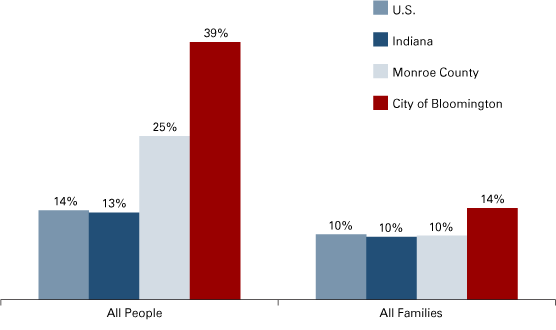
Note: The differences in 2005 to 2009 family poverty for Monroe County compared to Indiana and the U.S. are not statistically significant at a 90 percent confidence level.
Source: IBRC, using U.S. Census Bureau 2009 American Community Survey 5-year estimates
Bad News, Good News
There are good things and bad things in store for the region in the coming years. The 2012 closing of the Otis Elevator plant on Curry Pike tempers one’s optimism for the near future. Even considering the scaled down operation at the site (the plant’s current employment of about 225 is down from its height in 1989 of nearly 1,200 workers), the economic impact is not trivial. Including the Otis employees that will lose their jobs or be relocated elsewhere, the total job loss in the Bloomington area is estimated to be about 400 as a result of the closure.1 By way of perspective, the Bloomington MSA lost, on average, about 800 jobs each year in 2009 and in 2010 due to the economic downturn. The plant closure would add another 400 jobs on top of those jobs lost due to the recession.
On the brighter side, the Crane Naval Surface Warfare Center continues to be an important economic force for Bloomington and the region. Crane employs about 4,000 people. A large portion of those employees live in Bloomington. Based on 2009 data, 741 people a day commuted from Monroe County to Martin County. Only Lawrence County beats Monroe County as the bedroom community for Crane’s relatively well-compensated engineers and technicians.
Figure 7: Commuting Out of Monroe County, 2009
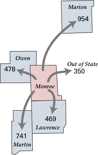
Source: STATS Indiana Commuting Profiles
While relatively few Monroe residents commute to Daviess and Greene counties today, that may change in the future as the technology park at Crane’s Westgate expands. In Daviess County alone, employment in professional, scientific and technical services jumped from just over 150 to 700 in five years. The change in employment in professional, scientific and technical services from 2004 to 2009 in Greene County was even more dramatic. While the significant five-year job growth in professional, scientific and technical services in Greene and Daviess counties is not reflected in commuting statistics from Monroe County, one might expect that Westgate-based workers seeking entertainment and cultural amenities would put down roots in Bloomington and its environs, adding to its growth and economic vitality.
Notes
Also in this Issue…
- Outlook for 2012
- International Outlook for 2012
- U.S. Outlook for 2012
- Financial Outlook for 2012
- Housing Market Outlook for 2012
- Indiana's Outlook for 2012
- Indiana's Agricultural Outlook for 2012
- Anderson Forecast 2012
- Bloomington Forecast 2012
- Columbus Forecast 2012
- Evansville Forecast 2012
- Fort Wayne Forecast 2012
- Gary Forecast 2012
- Indianapolis-Carmel Forecast 2012
- Kokomo Forecast 2012
- Lafayette Forecast 2012
- Louisville Forecast 2012
- Muncie Forecast 2012
- Richmond Forecast 2012
- South Bend and Elkhart Area Forecast 2012
- Terre Haute Forecast 2012
Inside This Issue
Outlook 2012 (Winter 2011)
Volume 86, No. 4
- Outlook for 2012
- International Outlook for 2012
- U.S. Outlook for 2012
- Financial Outlook for 2012
- Housing Market Outlook for 2012
- Indiana's Outlook for 2012
- Indiana's Agricultural Outlook for 2012
- Anderson Forecast 2012
- Bloomington Forecast 2012
- Columbus Forecast 2012
- Evansville Forecast 2012
- Fort Wayne Forecast 2012
- Gary Forecast 2012
- Indianapolis-Carmel Forecast 2012
- Kokomo Forecast 2012
- Lafayette Forecast 2012
- Louisville Forecast 2012
- Muncie Forecast 2012
- Richmond Forecast 2012
- South Bend and Elkhart Area Forecast 2012
- Terre Haute Forecast 2012


The Indiana Business Review is a publication of the Indiana Business Research Center at Indiana University's Kelley School of Business. Permission to use the material is encouraged, but please email us at ibrc@iu.edu to indicate you will be using the material and in what other publications. Privacy Notice