
Occupational Hazard: Why Indiana’s Wages Lag the Nation
Director of Economic Analysis, Indiana Business Research Center, Kelley School of Business, Indiana University
Research Assistant, Indiana Business Research Center, Kelley School of Business, Indiana University
Last year, Indiana’s per capita personal income (PCPI) was $34,605—more than $5,000 below the national average. Since 2001, per capita income has grown at an average annual rate of 3.6 percent for the United States but only 3 percent for Indiana (see Figure 1).
Figure 1: Per Capita Personal Income, Indiana Versus United States, 2001–2008
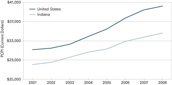
Source: IBRC, using data from the Bureau of Economic Analysis
In the Fall 2009 issue of the Indiana Business Review, Andy Zehner discussed many of the occupational dynamics that contribute to Indiana’s lackluster personal income performance. The key to understanding Indiana’s low PCPI is dissecting the state’s occupational mix and, with it, the compensation associated with those occupations. It is of no surprise that from 2001 to 2008, the state’s average annual wage for all occupations, published by the Bureau of Labor Statistics (BLS), has marched in lock-step with changes in per capita income reported by the Bureau of Economic Analysis (see Figure 2).
Figure 2: Indiana Personal Income Versus Average Wage, 2001–2008
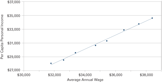
Source: IBRC, using data from the Bureau of Economic Analysis and Bureau of Labor Statistics
Zehner makes several important points:
- The decline in manufacturing jobs isn’t sufficient to cause sluggish PCPI growth.
- Workers across the board—with a few exceptions—are paid less in Indiana than for comparable jobs in other states.
- The lower Indiana cost of living doesn’t make up for the difference.
- Attracting manufacturing plants—“economic development”—won’t boost average compensation.
In this article, we will dig deeper to analyze occupational data in greater detail and uncover the shifts in Indiana’s workforce that would explain why it is so difficult to move the PCPI needle. Using shift-share analysis that dissects the difference in wages between the state and nation, we present trends in Indiana’s occupational mix and compensation using the United States as the benchmark. Then, we compare Indiana’s performance within the Midwest.
Shift-Share Analysis
Indiana’s occupational mix changes over time. Some occupations wax and others wane. Health care occupations are on the rise, for example. Printing machine operators, on the other hand, are in decline. Over time, one should see the percentage of health care occupations increase and the percentage of printing machine operators decrease.
Few occupations share the same compensation profile. Thus, as one occupation that pays well in Indiana is ascendant and another occupation that pays relatively poorly is in decline, all other things equal, the average wage would increase.
Shift-share analysis enables us to track these types of changes as the economy transforms. Shift-share analysis breaks down wage differentials into three components:
- Wages: This component measures the extent to which the difference between state and national average wage is due to the difference between state and national wages for a given occupation.
- Occupation Concentration: This component measures the extent to which the difference between state and national average wage is due to the difference between state and national share of employment for a given occupation.
- Residual: This component measures the extent to which the difference between state and national average wage is due to factors other than those related to wage and share of employment for a given occupation.
We sorted the twenty-two broad occupation categories defined and reported by the BLS according to their average national wage and then grouped them into three sets—higher, middle and lower wage. Table 1 presents these three tiers of occupations (broadly defined) showing differences in wages between the United States and Indiana for 2008. These data present a snapshot of Indiana’s occupation mix relative to the nation using recent data from the BLS Occupation Employment Survey (OES).1
Table 1: Tiers of Occupations by National Average Wage, 2008
| Occupation | Indiana Employment | Concentration Relative to the United States | Average Indiana Wage | Average National Wage | Difference |
|---|---|---|---|---|---|
| Higher Tier | |||||
| Management | 108,640 | 82% | $86,800 | $98,230 | -$11,430 |
| Legal | 13,875 | 64% | 67,735 | 90,360 | -22,625 |
| Computer and Mathematical | 43,310 | 61% | 61,800 | 73,345 | -11,545 |
| Architecture and Engineering | 46,170 | 85% | 61,315 | 70,155 | -8,840 |
| Health Care Practitioners and Technical | 159,905 | 105% | 60,920 | 66,455 | -5,535 |
| Business and Financial Operations | 90,630 | 69% | 56,130 | 63,565 | -7,435 |
| Life, Physical, and Social Science | 19,400 | 70% | 51,375 | 63,150 | -11,775 |
| Arts, Design, Entertainment, Sports, and Media | 31,430 | 81% | 38,910 | 49,540 | -10,630 |
| Middle Tier | |||||
| Education, Training, and Library | 163,895 | 90% | $42,805 | $47,535 | -$4,730 |
| Construction and Extraction | 139,275 | 97% | 42,695 | 41,485 | 1,210 |
| Installation, Maintenance, and Repair | 133,760 | 114% | 40,545 | 40,580 | -35 |
| Community and Social Services | 33,190 | 84% | 37,005 | 41,165 | -4,160 |
| Protective Service | 55,950 | 83% | 33,715 | 39,475 | -5,760 |
| Production | 380,820 | 175% | 33,485 | 31,815 | 1,670 |
| Sales and Related | 296,350 | 95% | 32,775 | 35,660 | -2,885 |
| Lower Tier | |||||
| Transportation and Material Moving | 262,530 | 126% | $30,725 | $31,065 | -$340 |
| Office and Administrative Support | 455,615 | 90% | 29,550 | 31,710 | -2,160 |
| Farming, Fishing, and Forestry | 3,105 | 32% | 27,385 | 23,100 | 4,285 |
| Health Care Support | 73,235 | 91% | 25,465 | 25,970 | -505 |
| Building and Grounds Cleaning and Maintenance | 92,015 | 96% | 22,880 | 23,965 | -1,085 |
| Personal Care and Service | 62,780 | 85% | 22,340 | 24,050 | -1,710 |
| Food Preparation and Serving Related | 262,325 | 106% | 18,050 | 19,830 | -1,780 |
Source: IBRC, using data from the Bureau of Labor Statistics
Note that no broad occupation group in the higher tier has a greater wage in Indiana than the national average. With the exception of farming, fishing and forestry, no lower-tier occupation group in Indiana has a greater average wage than the national average. Only in the middle tier does Indiana have two occupation groups—production and construction/extraction—that enjoy wages exceeding the national average.
The shift-share analysis brings a slightly different perspective. In a sense, it balances both the percentage of an occupation as well as the wage of an occupational group. In this way, the transportation occupation group, even though it has an average Indiana wage lower than the national average, contributed to Indiana’s average wage positively across all occupations. This is because the percentage difference of those engaged in these occupations in Indiana is much larger than the percentage difference of the average wage in the United States and Indiana. Indiana saw its biggest contribution to wages from production occupations. Installation and maintenance also positively contributed. These three occupation groups were the only positive contributors to Indiana’s average wage compared to the U.S. average. The other occupation groups pulled down Indiana’s average. The biggest drags on wages were from management, business and finance, office and administrative support, and computer and mathematical occupations.
Next, we investigate trends in these occupations. Table 2 compares Indiana’s occupational trends with the United States between 2001-2002 and 2007-2008 for the three wage tiers.
The higher tier of Table 2 shows that the state has lost jobs in both management and the architecture and engineering occupation group. However, it has been gaining jobs in two occupations that have historically weighed down the state-nation wage differential. Since early in the decade, Indiana has added 7,100 computer and mathematical jobs—a 19.6 percent increase that tops the national increase of 16.1 percent. Indiana also gained 7,175 business and finance jobs, but the rate of increase of 8.6 percent fell significantly below the national increase of 28.6 percent.
Table 2: Wage and Employment Change among Occupation Tiers, January 2002–July 2008
| Occupation | Change in Employment* | Change in Wages* | ||||
|---|---|---|---|---|---|---|
| Indiana** | United States | Indiana** | United States | |||
| Higher Tier | ||||||
| Management | -21,870 | -16.8% | -15.0% | $18,860 | 27.8% | 31.3% |
| Legal | 2,210 | 18.9% | 8.5% | 14,205 | 26.5% | 23.5% |
| Computer and Mathematical | 7,100 | 19.6% | 16.1% | 9,880 | 19.0% | 20.3% |
| Architecture and Engineering | -5,205 | -10.1% | 2.2% | 10,585 | 20.9% | 22.7% |
| Health Care Practitioners and Technical | 14,730 | 10.1% | 13.4% | 12,845 | 26.7% | 27.9% |
| Business and Financial Operations | 7,175 | 8.6% | 28.6% | 10,345 | 22.6% | 22.3% |
| Life, Physical, and Social Science | 3,420 | 21.4% | 18.9% | 6,965 | 15.7% | 23.7% |
| Arts, Design, Entertainment, Sports, and Media | 7,010 | 28.7% | 18.4% | 7,375 | 23.4% | 21.7% |
| Middle Tier | ||||||
| Education, Training, and Library | 12,450 | 8.2% | 8.7% | 5,465 | 14.6% | 19.9% |
| Construction and Extraction | 440 | 0.3% | 7.2% | 5,285 | 14.1% | 15.6% |
| Installation, Maintenance, and Repair | 1,370 | 1.0% | 2.1% | 4,685 | 13.1% | 14.7% |
| Community and Social Services | 6,085 | 22.4% | 17.9% | 6,185 | 20.1% | 19.6% |
| Protective Service | 3,110 | 5.9% | 4.5% | 6,060 | 21.9% | 19.9% |
| Production | -31,210 | -7.6% | -8.8% | 3,650 | 12.2% | 14.1% |
| Sales and Related | 15,070 | 5.4% | 7.1% | 5,525 | 20.3% | 19.8% |
| Lower Tier | ||||||
| Transportation and Material Moving | 15,815 | 6.4% | 1.8% | 3,015 | 10.9% | 15.5% |
| Office and Administrative Support | 790 | 0.2% | 2.1% | 4,095 | 16.1% | 15.0% |
| Farming, Fishing, and Forestry | -1,340 | -30.1% | -2.0% | 5,455 | 24.9% | 15.9% |
| Health Care Support | 11,305 | 18.3% | 17.6% | 3,845 | 17.8% | 17.2% |
| Building and Grounds Cleaning and Maintenance | 1,225 | 1.3% | 3.5% | 2,595 | 12.8% | 16.3% |
| Personal Care and Service | 8,910 | 16.5% | 18.5% | 2,420 | 12.1% | 13.5% |
| Food Preparation and Serving Related | 14,180 | 5.7% | 13.6% | 1,850 | 11.4% | 17.0% |
*January 2002 to July 2008
**Left column is jobs lost/gained and right column is percent change
Source: IBRC, using data from the Bureau of Labor Statistics
Production jobs have been on a downward trend, as the middle tier of Table 2 shows. Since 2001-2002, the state has lost 31,200 jobs in production. This is especially bad news since production occupations have been exerting positive pressure on the state-nation wage differential primarily through the disproportionately large share of employment in these occupations, but also due to the higher average wage in Indiana relative to the nation (refer back to the middle tier of Table 1). Employment in transportation occupations has grown by 15,800, as shown in the lower tier of Table 2, but because the average wage for this occupation group is below the state average of $37,090, growth in this employment exerts negative pressure on Indiana’s average wage and income.
Comparing Indiana with the Midwest
Having documented that Indiana’s per capita personal income and average wage for most occupations lag behind the U.S. averages, we turn our attention to understanding possible sources of this discrepancy. The preliminary shift-share analysis revealed that some typically higher-paid occupations, such as management or finance, paid less on average in Indiana than in the United States as a whole. In addition, these higher-paying occupations constituted smaller percentages of total employment than the nation as a whole. Indiana has a heavy concentration of production occupations, and accordingly, that occupational category has the greatest effect on Indiana’s average wage.
The following analysis compares the occupational dynamics of ten Midwestern states using the same three tier occupation sets. Figure 3 plots the overall wage difference for the Midwest. Only three states had a wage component which had a positive impact on the overall wage differential relative to the U.S. average. Illinois and Minnesota improved their overall standing between 2001-2002 and 2007-2008. Michigan, while still having a positive wage component, lost ground during the time period.
Figure 3: Total Wage Differential for All Occupations
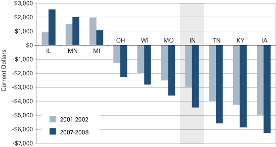
Source: IBRC, using data from the Bureau of Labor Statistics
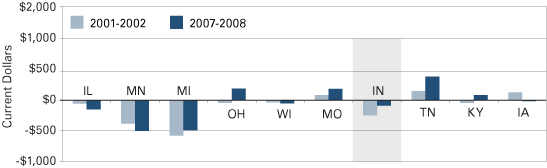
The Lower Tier
Figures 4 and 5 highlight the change in the lower tier for Midwestern states in 2001-2002 and 2007-2008. Not surprisingly, wages for low-paying jobs in states with positive overall differentials are higher than the national average, and those in states with negative differentials are lower than the national average (see Figure 4).
Figure 4: Lower Tier Wage Component
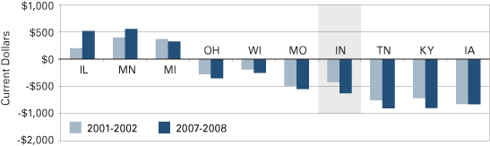
Source: IBRC, using data from the Bureau of Labor Statistics
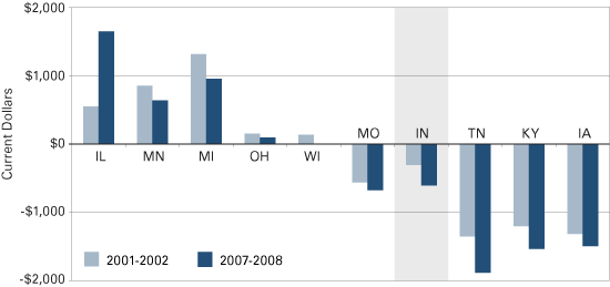
Figure 5 plots the occupational mix component. The takeaway point for this graph is that the Midwest does not appear to deviate much from the average national proportion of jobs in the lower tier. This suggests that these occupations, such as health care support, maintenance jobs, and personal care and support, do not have a material effect on Indiana’s (or the Midwest’s) overall wage differential one way or the other.
Figure 5: Lower Tier Occupation Concentration Component
Source: IBRC, using data from the Bureau of Labor Statistics
The Middle Tier
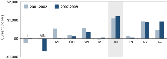
Figure 6 plots the wage component and Figure 7 the occupational component for the middle wage tier. Here, important dynamics begin to appear.
The wage components in the middle tier mimic the trend in total wage for all occupations differentials (with the exception of Minnesota). The occupational components, on the other hand, reveal the drivers of much of the Midwest’s wage differential. Midwestern states, and Indiana in particular, tend to have higher percentages of workers in this category than the national average. Unfortunately, this positive differential is mostly canceled out by the negative wage components for these same occupations.
Indiana is the poster child for this dynamic. Relatively speaking, Indiana has experienced a rise in the number of workers in the middle tier from 2001-2002 to 2007-2008, as Figure 7 shows. But, as Figure 6 shows, the wage component has been deteriorating. This dynamic leads one to conclude that the loss of manufacturing jobs doesn’t explain Indiana’s lackluster PCPI performance, and that economic development—to the degree that economic development means capturing more manufacturing plants—won’t improve Indiana’s average incomes.
Figure 6: Middle Tier Wage Component
Source: IBRC, using data from the Bureau of Labor Statistics
Figure 7: Middle Tier Occupation Concentration Component
Source: IBRC, using data from the Bureau of Labor Statistics
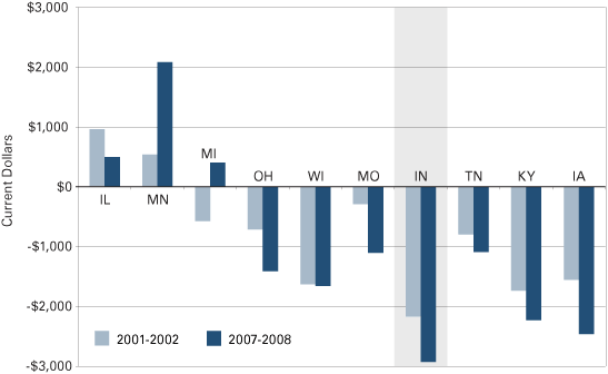
The Higher Tier
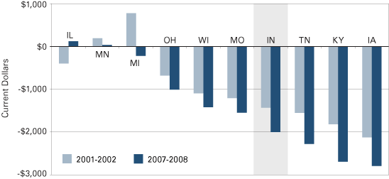
As disheartening as the conclusions drawn from the dynamics of the middle wage tier may be, the higher wage tier accounts for a vast majority of the PCPI performance of Indiana and the Midwest. Figures 8 and 9 highlight the difference in the higher wage tier.
This tier drives the negative wage differential observed in most Midwestern states relative to the nation as a whole, as shown in Figure 8. Average wages for the occupations in this tier are generally below the national average. Even Illinois and Minnesota, the states that are doing relatively well in the Midwest, do not have average wages that are materially different than the national average. That said, the movement of the wage component in Illinois in the higher tier from negative to positive from 2001-2002 to 2007-2008 explains the boost in overall wage differential. Conversely, the opposite shift in Michigan in the higher tier explains the less favorable shift in the overall wage difference over the period.
Figure 9 presents the occupation concentration component. The percentage of total employment devoted to the higher-paying occupations relative to the United States helps to identify whether a state has a positive or negative overall wage differential. An interesting comparison is between Minnesota and Indiana. Relative to the nation, Minnesota’s portion of employment in the higher-paying tier shot up between 2001-2002 and 2007-2008. Conversely, Indiana’s fell. Relative to its Midwestern neighbors in 2001-2002, Indiana had the lowest proportion of its workforce in the higher-earning occupation tier. In 2007-2008, the concentration in this occupation tier further deteriorated. This negative dynamic is the primary explanation for Indiana’s poor average earnings performance.
Figure 8: Higher Tier Wage Component
Source: IBRC, using data from the Bureau of Labor Statistics
Figure 9: Higher Tier Occupation Concentration Component
Source: IBRC, using data from the Bureau of Labor Statistics
Drilling Deeper: The Forward/Reverse Index
Stratifying aggregate occupation categories into three tiers provides some perspective on Indiana’s relative weaknesses in terms of the state’s occupational mix. But it doesn’t tell the whole story. Even within under-performing occupation categories, there are some winners. Below, we present more detail on some selected occupations as well as introducing a “forward/reverse index.” This index indicates whether a specific occupation trend over time for, say, industrial production managers, is having an increasing or decreasing effect on Indiana’s wage or income averages. There are two components to the “forward/reverse index” (FRI).
- The ratio of the rate of increase in Indiana’s average wage for an occupation divided by the rate of increase in the U.S. average wage. In other words, this component looks at whether Indiana is gaining ground or losing ground on the wage front. For instance, if Indiana’s average wage for team assemblers grew by 5 percent over the study period—from 2001-2002 to 2007-2008 in this case—and the national average wage for team assemblers grew by 5 percent as well, this component would be 1. If Indiana’s average wage for team assemblers outpaces the U.S. average wage, the ratio will be greater than 1.
- The ratio of the change in the occupation’s concentration over time. It addresses the question of whether the relative concentration of a given occupation is rising or falling relative to the nation. For instance, if the percentage of Indiana’s employment consisting of team assemblers increased while the percentage of the nation’s workforce in this occupation decreased, this component would be greater than 1. The concentration component ratio would be less than 1 if the U.S. percentage of team assemblers grew more quickly than the percentage of that occupation in Indiana.
The FRI itself is derived by simply multiplying these two components. Thus, an index over 1 for a given occupation signifies that either one of the two components was large enough to offset a low value in the other, or that both components were greater than 1. In either case, a number above 1 shows a specific occupation is increasing in its effect upon Indiana’s average wage (and income). Conversely, a number below 1 indicates that an occupation’s effect on wages with the state is waning.
By looking at the two components that make up the FRI, one can also note whether an occupation is rapidly raising Indiana’s averages. For example, both the wages and concentration of medical and health service managers have been growing faster than the nation. Thus, this occupation might be viewed as accelerating the pace by which Indiana would close the gap between state and the U.S. averages.
The FRI isn’t perfect and should be handled with care. For example, an occupation that is increasing in concentration will lower the state average wage if that occupation’s wage is less than the state average. Thus, an increasing concentration in food preparation and serving occupations would pull the state average wage down. For those occupations that are in the middle and lower tiers, one must be aware of the average wage for a particular occupation.
To demonstrate how the FRI can be used, Table 3 presents the results of prominent occupations within four major occupational categories: management occupations, business and financial occupations, production occupations, and transportation occupations. As it relates to the three tiers discussed earlier, the management and business and financial categories represent the higher tier, while the production category lands in the middle tier and the transportation occupations are in the lower tier.
First we’ll look at selected occupations within the management category in Table 3.2 Industrial production managers and sales managers have been on a relative tear, with index values of 1.34 and 1.25, respectively. They have exerted positive pressure on Indiana’s overall wage and income averages by gaining in concentration. Industrial production managers are especially interesting in that, while their average wage has kept pace with the U.S. average for the occupation, their concentration in Indiana relative to their concentration nationwide has increased by a third. Trends in occupations that have not exerted positive pressure on Indiana averages include general and operations managers as well as education administrators because of decreasing concentration relative to the nation.
Table 3: The Forward/Reverse Index of Prominent Occupations Comparing Indiana to the United States
![]() Indicates that the occupation unambiguously helps to lift Indiana’s average wage
Indicates that the occupation unambiguously helps to lift Indiana’s average wage
| Occupation Category | Ratio of Wage Change | Ratio of Concentration Change | FRI | |
|---|---|---|---|---|
| Higher Tier | Management | |||
| Industrial Production Managers | 1.00 | 1.33 | 1.34 | |
| Sales Managers | 0.95 | 1.31 | 1.25 | |
| Medical and Health Services Managers | 1.08 | 1.07 | 1.15 | |
| Chief Executives | 0.94 | 1.11 | 1.05 | |
| Construction Managers | 1.00 | 1.03 | 1.03 | |
| Education Administrators, Elementary and Secondary School | 0.95 | 0.90 | 0.86 | |
| General and Operations Managers | 1.01 | 0.81 | 0.82 | |
| Business and Financial | ||||
| Training and Development Specialists | 1.03 | 1.18 | 1.22 | |
| Management Analysts | 0.98 | 1.17 | 1.15 | |
| Cost Estimators | 1.02 | 1.05 | 1.07 | |
| Purchasing Agents, Except Wholesale, Retail, and Farm Products | 1.03 | 0.94 | 0.96 | |
| Financial Managers | 1.01 | 0.94 | 0.94 | |
| Accountants and Auditors | 0.99 | 0.87 | 0.86 | |
| Loan Officers | 1.01 | 0.82 | 0.82 | |
| Middle Tier | Production | |||
| Team Assemblers | 1.07 | 1.12 | 1.20 | |
| Helpers–Production Workers | 0.97 | 1.22 | 1.18 | |
| Inspectors, Testers, Sorters, Samplers, and Weighers | 0.95 | 1.17 | 1.11 | |
| Cutting, Punching, and Press Machine Setters and Operators | 0.99 | 1.05 | 1.04 | |
| Machinists | 1.04 | 0.99 | 1.02 | |
| First-line Supervisors/Managers of Production and Operations | 1.01 | 1.00 | 1.00 | |
| Welders, Cutters, Solderers, and Brazers | 0.93 | 0.88 | 0.82 | |
| Lower Tier | Transportation | |||
| Laborers and Freight, Stock, and Material Movers | 0.92 | 1.27 | 1.17 | |
| Bus Drivers, School | 1.05 | 1.00 | 1.06 | |
| Truck Drivers, Heavy and Tractor-trailer | 0.96 | 1.09 | 1.04 | |
| Industrial Truck and Tractor Operators | 1.02 | 0.99 | 1.01 | |
| Driver/Sales Workers | 0.86 | 1.15 | 0.99 | |
| Truck Drivers, Light or Delivery Services | 0.92 | 1.05 | 0.96 | |
| Packers and Packagers, Hand | 0.97 | 0.87 | 0.85 | |
Source: IBRC, using data from the Bureau of Labor Statistics
While many management occupations are helping to increase Indiana’s averages, business and financial occupations have had less positive effect (see the business and financial category of Table 3). Accountants and auditors, together with loan officers, have FRI values below 0.9, thus showing negative trends. On the other hand, the trends for training and development specialists, as well as management analysts, have put positive pressure on Hoosier state averages.
While the production occupation category has, on average, a higher wage than the nation, most of the prominent Indiana occupations in the production category of Table 3 do not necessarily have a positive effect on Indiana’s mean wage. It is noteworthy that Indiana team assemblers’ wage growth outpaced U.S. team assembler wage growth, and they constitute a growing share of Indiana’s workforce relative to the nation. That said, their average wage, because it is less than the Indiana average, pulls down the state average for all occupations. Only two of the prominent occupations in the production category unambiguously help to lift Indiana’s average wage:
- Machinists
- First-line supervisors/managers of production and operations
Leading transportation occupations shown last in Table 3 give a less rosy picture than those for production occupations. Only the wages of school bus drivers and industrial truck and tractor operators increased at a faster clip than the national average. Overall, the aggregated transportation category trails the U.S. average on the wage side, while greatly exceeding the average U.S. concentration. The wage and employment dynamics of this transportation occupation group and the evidence of several selected occupations point to the fact that this occupation group exerts downward pressure on Indiana’s average wage.
Access Full Data Set Online
Occupational wage, concentration and FRI data for all occupations—not just aggregate occupation groups or selected occupations—are available online at www.ibrc.indiana.edu/analysis/FRI.xlsx. Readers can conduct their own investigation at a more granular level as to what a particular occupation pays on average, whether Indiana has a relatively high or low concentration and whether the occupation is helping to pull up Indiana’s average wage relative to the United States.
Cost of Living— A Brief Excursus
As noted in the introduction, the Indiana cost of living, while lower than the national average, doesn’t make up for the lower average wage and personal income. But upon a closer look in average wages, several occupation groups swing from lower than the national average to even with or slightly higher than the national average after adjusting for the cost of living. These occupations are mostly in the lower wage tier. In fact, with the exception of food preparation and serving, all the occupation groups in the lower tier match or beat the national averages after adjusting for the cost of living. This is certainly good news for those on the lower end of the income spectrum.
Conclusion
Piggybacking on a previous article that investigated the occupational considerations that contribute to the state’s sub-par performance for personal income, we presented data and analysis on the wage and concentration trends of occupations in Indiana, the Midwest and the nation. We found that for the middle tier set of occupations that Indiana tends to concentrate in—jobs in production, for example—Indiana does not lag the nation or neighbors. The higher-earning tier, however, is where Indiana is at a comparable disadvantage. The lower concentration and lower wages of the occupations in the higher-earning tier contribute mightily to the gap between Indiana and U.S. average wages (and per capita personal income). While the relatively poor performance in the lower-earning tier also contributes to the income gap, this gap disappears when adjusting wages for the cost of living. We also examined some selected occupations to determine whether, and the degree to which, specific occupations help to narrow the wage gap.
This article was not originally conceived as a policy piece, but the nagging question as to how the state can narrow the wage and income gap persists. The first conclusion is that the better economic development initiatives would focus on cultivating business activities that employ people in the higher wage tier occupations. The Indiana Economic Development Corporation has been aggressive, and successful, in attracting investment, but if that investment results in expanding (or maintaining) employment in the middle wage tier, that will not narrow the wage and PCPI gap. Investment in manufacturing should be seen as akin to a medical trauma center—stopping the hemorrhaging, stabilizing the patient, but not returning the patient to full health. The long and hard work—physical therapy and athletic conditioning if you will—will require augmenting Indiana’s human capital. It will require brainpower and the business activities that emphasize brainpower, like company headquarters and high-tech companies. The higher wage tier occupations are the high brainpower jobs.
Indiana has the potential for those high brainpower jobs. The Hoosier state does quite well in terms of science and engineering graduates, well above the national average in terms of graduates per thousand of the state’s population. The state also has some top-shelf business schools. Employing those graduates in the state, however, remains the challenge.
Indiana may not be taking full advantage of its intellectual assets. For example, the Crane Naval Weapons Support Center filed over sixty patents in 2009 and hopes to file a hundred patents in 2010. Many of those patents can be commercialized. Will it be Indiana firms that bring those potential products or services to the market? Will those potential Indiana firms, once they become well-established, remain in Indiana (rather than being bought out by a larger firm on one of the coasts)?
These would be the high-impact business activities that could improve Indiana’s economic vitality as well as close the wage and income gap.
Other economic analysts and policy makers, no doubt, have other ideas and policy proposals to improve Indiana’s prosperity, but if those proposals do not expand the ranks of the higher-earning occupational tier, the PCPI and wage needle will barely budge.
Also contributing to this article was Alex Cohen, Research Assistant at the Indiana Business Research Center, Kelley School of Business, Indiana University.
Notes
- The data are averaged from the 2007 and 2008 OES. Because the survey results for specific, less numerous, occupations frequently have large margins of error and can be erratic, we averaged two years of data for more stable results.
- The FRI components are location quotients (LQs). Recall that an LQ, or location quotient, measures the relative concentration of an occupation compared to the United States. An LQ of 1.0 shows the state as having the same proportion of workers in a particular occupation. Greater than 1.0 indicates that the state is more concentrated in an occupation; less than 1.0 indicates less concentrated.