

As a measure of economic well-being, per capita personal income ain’t what it used to be
Co-Director, Indiana Business Research Center, Indiana University Kelley School of Business
If you don’t know how personal income per capita is calculated, you should probably consider using another measure for state or regional standard of living.
Introduction
Per capita personal income (PCPI) is currently (and if one had his way, soon formerly) the standard benchmark for general economic well-being at the national, state and regional level. Adjustments for the cost of living across states that are expensive to live in, relative to states with a lower cost of living, often serve to adjust the PCPI metric to make regional comparisons equitable. That said, the PCPI that may have served well as a measure decades ago may no longer be serving us well today or into the future. Rotary phones served our communication needs and the economy plenty well in the 1960s and 1970s, but even computerized touch-tone phones from the 1980s and 1990s cannot keep up with the connection and communication capabilities and needs of today.
We need something more current and more relevant.
Over the years, if not decades, the IBRC has published articles related to PCPI and why Indiana appears to be falling behind in this critical measure and benchmark of Indiana’s economic performance relative to other states. The motivation for this article is to alert the reader that the PCPI measure may not be performing as expected.
The motivation for this article is to alert the reader that the PCPI measure may not be performing as expected.
How the measure expresses the relative economic performance across states, regions and counties is an artifact of how the measure is constructed. The economy has undergone considerable restructuring over the last 50 years as we’ve moved from Meatspace to the Bitworld, and several of the components of PCPI reflect that restructuring.1 It is unfortunate that the subcomponents of what constitutes PCPI at a regional level are not available on a per resident basis or aggregate basis—for example, county resident dividends earned and capital gains/losses earned, royalty payments from natural resource extraction, returns to intellectual property (such as patents by residents versus corporate patent holders), and property rents associated with land, apartments, homes and other real estate. Such measures would not only help economists understand what drives economic growth—such as jobs or wages and salaries—but would also help us understand the structural income components of economic inequality.
One cannot tackle all these and collateral questions. But one can at least identify points of weakness in current measures and suggest a possible new metric for regional and state economic progress. Spoiler alert: The proposed measure isn’t perfect. And it doesn’t address the concerns related to making the structural income components of income sources available. One’s hope is that it will spur new thinking about what matters in terms of economic statistics and measures of economic performance.
The components of PCPI—the boring stuff—and the devil in the details
In this section, we try to distill the complicated sources and methods of how personal income and PCPI are reckoned in the national product and income accounts. (More detailed information is available directly from the data source for interested readers.2)
The sources of personal income inflows and outflows are difficult enough, but add in the geographic dimension—that where people work and earn income can vary greatly from where they live, receive and dispose of income—and the geographically specific identification of PCPI, by state, MSA or county, becomes quite the challenge.
The U.S. Bureau of Economic Analysis provides a lot of interesting detail in how income (as well as product/output) is measured—for example, there are estimates in the national accounts for what the owner of a mobile home would have to pay as rent if he or she rented that housing unit. And those imputed rent estimates are part and parcel of total personal income. But we will gloss over imputed for the moment to focus on the major income categories, with reference to their sub-components as warranted. The BEA line numbers relate to tables and data sets available on the BEA website.
- Headline personal income (BEA Line 10)
- Wages and salaries (Line 50)
- Net earnings by place of residence (Line 45)
- Dividends, interest and rent (Line 46)
- Personal current transfer receipts (Line 47)
- Adjustment for residence (Line 42)
Adjustment for place of residence
Doing the math on the national level, net earnings by place of work (Line 35) is wages and salaries plus employer contributions (61 and 62) plus proprietors’ income (70). These proportions/values and the additivity vary by region. This is why there is this an income and earnings adjustment for residence (in contrast to place of work). At the national level, the calls and the puts even out and, in round numbers of billions of dollars, cancel each other out. On a state, regional and especially county level, adjustment for residence can matter greatly.
Let’s say that about 40% of the workers at Crane NSWC in Martin County, Indiana, live in Monroe County. Crane is a commuter campus in other words. While those paychecks are cut in Martin County, a vast majority of the Crane NSWC workforce lives outside the county. And yet, the Social Security payments and the benefits, be they matching retirement accounts or health insurance benefits, are registered from Martin County and those benefits are personal income. The adjustment for place of residence allocates the earnings and supplements to where the workers live. After all, the PCPI uses per person as the denominator and the relevant number of persons are residents based on census counts.
These adjustments can matter in terms of scale depending on population of the county and the relative size of the employer. The Martin County adjustment is -1.3 and the earnings by place of work are almost 2.1 times greater than the headline personal income for the county. In contrast, the Monroe County adjustment is -0.04 and the earnings by place of work are 0.73 times greater—really means less—than the headline personal income number.
The four counties with the largest adjustment in 1969 were counties with a small residential footprint: Martin, Indiana; Barrow-North Slope Division, Alaska; Butte, Idaho; and Nye, Nevada. In 2019, Butte, Idaho, and Martin, Indiana—both with federal facilities—were still in the top 10 commuter counties, with other counties popping up because of industry investments distinct from residential communities, for example, Storey County, Nevada. Constrained and dense city centers also show this same effect, for example, Washington, D.C., where for decades there has been the threat of a commuter tax, and the county of San Francisco, while not registering as highly on the commuter factor as Washington, D.C., is another example of why the adjustment for residence is required. The commuter effect is also evident in smaller cities and places in which there is a solitary large employer that serves as an employment magnet to the surrounding region; Howard County—ranking 238th of 3,100 plus counties in terms of the adjustment for residence —is another example of a cluster of production activity drawing commuters from well beyond county boundaries.
Types of income
Having stated the need to adjust geographically incoming income differently than geographically outgoing income, we turn our attention to three of the more important income source categories for our analysis: 1) net earnings by place of residence; 2) dividends, interest and rent; and 3) personal current transfer receipts.
There are plenty more subcategories and dimensions and wrinkles in the data source and estimation method, but rather than getting into the thick and tall weeds, let’s just see the degree to which these three (plus wages and salaries) can tell a story about economic performance and changes in regional economic dynamics and structure. Most of what follows is pulled directly or edited slightly from the recent November 2020 BEA documentation: Local area personal income methodology.
One criticism—or when I talk to my kids, the “delta”—of the documentation is that one can look up an important line number or concept like “net earnings by place of residence” (Line 45) and not find anything. It is important because total personal income is the sum of net earnings by place of residence; dividends, interest and rent; and personal current transfer receipts. Yet it seems to be overlooked. One must conduct his own crosswalk to reassemble the pieces and subcomponents of personal income.
Wages and salaries
Wages and salaries are broadly defined to include commissions, tips and bonuses; voluntary employee contributions to deferred compensation plans, such as 401(k) plans; employee gains from exercising stock options; and receipts-in-kind that represent income. Wages and salaries are measured before deductions, such as Social Security contributions, union dues and voluntary employee contributions to defined contribution pension plans. They represent the amount of wages and salaries accrued during the year and account for 50.2% of total personal income at the national level.
Property income
Dividends, interest and rent (DIR) is another way to say property income. It would probably be better called asset income or return to capital, in contrast to wages and salaries as returns to labor as a factor of production. Maybe it is not called return to capital because it leads one to ask the question: Where do profits show up in the income accounts? The answer isn’t directly evident. (One can tie a paycheck to a labor factor of production who lives in county X. Figuring out who owns the capital—financial or physical—that earns returns and where they live as a shareholder is a massive challenge. Who owns Amazon? Good chance you own a sliver.) Estimates of personal dividend income, personal interest income and rental income of persons comprise property income, accounting for 20.7% of total personal income at the national level in 2019.
So far so good, but here is where the screen goes snow crash. According to BEA documentation, the national estimates of dividends, interest and monetary rent are based on data that may not be available for all states. As a result, state allocations of the national estimates of the property income received by individuals are based mainly on individual income tax data. There are allocations at the state level; county-level allocations are likely more tenuous.
Full disclosure: The way DIR is estimated gives the author heartburn, and the absence of details for an increasingly important data time series on national/state/regional performance and well-being is troubling. There are many imputations—estimations of price and value based not on market transactions but on estimation methodology.
The absence of details for the increasingly important dividends, interest and rent (DIR) time series is troubling.
The BEA does its best to figure out how to allocate income from sources like dividends from pension plans because the dividends are not sent to a particular person in a particular place who then claims them on her taxes. Assigning those income streams to people and locations is more difficult than assigning ordinary dividends; those checks arrive in the mail and are reported to the IRS. There are also imputed values associated with no-cost services provided by banks for certain accounts and bank services. If someone has to pay to have a checking account at First National Bank but you get “free checking,” that creates an asymmetry in cost and value of produced services in the national accounts. Believe it or not, it gets even more complicated. There are imputations for what is estimated as rent in personal income for owner-occupied homes.
Personal dividend income
Personal dividend income is the cash and other assets, excluding the corporations’ own stock, that U.S. residents receive from U.S. and foreign corporations. Personal dividend income accounted for 6.9% of total personal income at the national level in 2019.
Personal interest income
Personal interest income is the interest received (monetary and imputed) by people, including individuals and nonprofit institutions serving households, from all sources. Personal interest income accounted for 9.5% of total personal income at the national level.
Rental income of persons
The rental income of persons with capital consumption adjustment—buildings depreciate and capital assets wear out—is the net current-production income of persons from the on-the-income-statement rental of real property, the imputed net rental income of owner-occupants of farm and nonfarm dwellings, and the royalties received by persons from patents, copyrights, and rights to natural resources. Rental income of persons is quite a mouthful.
The rental income of persons is a conglomeration of market and imputed values for income from real property dwellings, income from mineral rights (mostly associated with oil and gas extraction, and those stripper wells in Texas may be owned by a retiree in New Hampshire), and royalties from arguably the most important asset today—intellectual property. The national estimate of the rental income of persons accounted for 4.2% of total personal income in 2019. In the BEA documentation, it states that monetary rental income accounts for 1.3% of total personal income, while imputed rental income accounts for 3.0%. The trouble is that rental income of persons has three important and distinct sources, and there isn’t a breakdown of those three sources.
Please read that again: Imputed rental income accounts for 3.0%—as stated in the BEA documentation. Considering that about two-thirds of American households own their homes and pay (according to the mortgage payment rule of thumb) one-third of their take-home income on rent or mortgage, is 4.2% net rent of persons after depreciation reasonable when it also includes royalties and mineral rights? Nationally, the consumer expenditure percent for housing, which include utilities, is about 18 or 19%. For states like California and Washington, the percentage gravitates toward 22%. Simple math makes one question the 4.2%. In round order of magnitude numbers, if half of total personal income is wages and salaries and if one applies the one-third rule for mortgages or rent, that puts home “rents” at about 16%. Then, let’s halve that to adjust for depreciation and adjustments for taxes. The rental portion is around 8%, twice the rental income of persons’ proportion that also includes mineral rights and intellectual property.
I’d be happy to be proven wrong and chastised for being completely off base. But the only way to really know if the accounts can be improved and brought up to date is to see the methodology in action. Step by step. To see how the sausage is made. Considering the increasing importance of intellectual property and the economic equity issues associated with housing availability, rental prices and regional housing and local zoning policies across geographic space, we need full transparency on how estimates, imputed or market measures, are derived. Small percentage differences in performance metrics can have a tremendous impact.
Personal current transfer receipts
Personal current transfer receipts are benefits received by persons for which no current services are performed. They are payments by governments and businesses to individuals and nonprofit institutions serving individuals (which are classified as persons in the state personal income accounts). Transfer receipts accounted for 16.9% of total personal income at the national level in 2019.
Retirement and disability insurance benefits (e.g., Social Security benefits) accounted for 34.1% of total transfer receipts at the national level in 2019. Medical benefits (including Medicare and Medicaid) were the major transfer payment category, accounting for 45.6% of total transfer receipts. Income maintenance benefits—supplemental security income, the earned income tax credit and supplemental assistance like SNAP (food stamps)—were relatively small at 8.6% of total transfer receipts. Veterans’ benefits accounted for 4.2% of total transfer receipts at the national level in 2019.
Unemployment insurance (UI) compensation falls under the transfer receipts umbrella, but accounted for 0.9% of transfer receipts at the national level in 2019. On an average year with low unemployment, UI does not amount for much, but when there is a large economic downturn, such as the Great Recession or the COVID-19 recession, this category can spike.
In summary, Table 1 presents the important national percentages in terms of total personal income for 2019 from the BEA release in November 2020. (Note: The values in Table 1 are from the personal income data release—CAINC4: November 17, 2020—whereas the above proportions are from the personal income documentation. Even within the documentation itself, the values may not be completely consistent from one table to the next because of lags and sequencing of estimate production and drafting documentation.)
Table 1: Percentage of U.S. total personal income by category, 2019
| Income category | Percent of total personal income | Current $ (in millions) |
|---|---|---|
| Headline total personal income | $18,542,262 | |
| Wages and salaries—place of work | 50.2% | $9,300,811 |
| Net earnings by place of residence (includes benefits and supplements) | 62.9% | $11,667,012 |
| Dividends, interest and rent | 20.2% | $3,750,076 |
| Personal current transfer receipts | 16.9% | $3,125,174 |
| 100.0% | ||
Source: IBRC, using U.S. Bureau of Economic Analysis data
Before moving on to the next section, it is important to note that those percentages of total personal income by category are not fixed, are not stable, and have changed considerably over time depending on what state or region is under analysis.
How the relative structure of the components of PCPI have changed over time
Before the advent of “technology”—to mean manipulating ones, zeros and pixels (even though a wagon wheel is a technology)—most economic output involved labor manufacturing physical products. The demarcation lines were wages (think blue-collar workers) and returns to physical capital as profits. Then the lines blurred somewhat with wages and salaries (think blue- and white-collar work) and returns to financial and physical capital as profits. And more recently, that white-collar work has in general terms divided into: 1) managers who may invent new ways of organizing production processes like logistics, optimize supply-chain efficiency and commercialize new technologies into products and services; 2) inventors and scientists who create new products; and 3) tech workers who blend 1 and 2, along with minimizing the blue-collar labor cost input. The latter may or may not be sourced locally, or even nationally, to maximize the value chain. (This isn’t a comprehensive list, but it gets the point across.)
As it happens, the higher-earning classes—the managers, scientists and techies—tend to congregate (i.e., hang out with each other). They socialize and work and live alongside each other. And they tend to be mobile and footloose. Many, if not a majority (as seen by the relocation of certain types of work with the COVID-19 shutdowns), can work from a laptop and add value to the enterprise from almost anywhere. Creative people who enjoy cultural and natural amenities spend time with each other outside of the office. (This dynamic is the basis for Richard Florida’s creative class.) They tend to be well-paid—the upper 20% income bracket—and drive up the cost of real estate. Wherever they decide to live, whether for the scenery, recreation options or for the community connections, they drive up the cost of living.
Consider the added value of the workers that make physical products. Their coproduction input isn’t a $1,000 laptop, it is a $5 million computer-assisted lathe with robotic arms—and it doesn’t travel well. These workers are, relatively speaking, rather stuck in place, and the demand for their labor has declined.
So the question then becomes: How is this production and economic transformation reflected in the PCPI data? Can it, with additional income source detail, be more easily understood? And if so, how?
We will walk through the data on three components of PCPI and attempt to determine whether it is a fair measure for how well a region is doing, be it a state or a county.
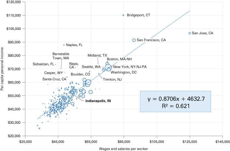
Based on Figure 1, it appears that wages and salaries (W&S) comprise the lion’s share of PCPI across the largest metro areas. The shaded chart box shows the regression equation. We are trying to understand what explains (or drives) the difference in PCPI across regional boundaries like states or counties—the dependent variable “y.” The variation across regions can largely be explained by “x” (i.e., wages and salaries per worker)—and this is why “x” is often called the explanatory variable. The R-squared value indicates how much of the dependent variable “y” can be explained by the variable “x.” In the figures that follow, “y” is shown on the vertical axis and “x” is shown on the horizontal axis.
As one of my professors in college stated (yes, a long while ago), “If wages and salaries aren’t around 80% of national income, you need to rerun your numbers.” And so it appears that a snapshot of the top 50 MSAs in terms of population shows that wages and salaries explain about 87% of the variation in PCPI. Would the prof tell me to rerun my numbers? Yes … and no.
Figure 1: Wages and salaries and PCPI for the top 50 MSAs by population
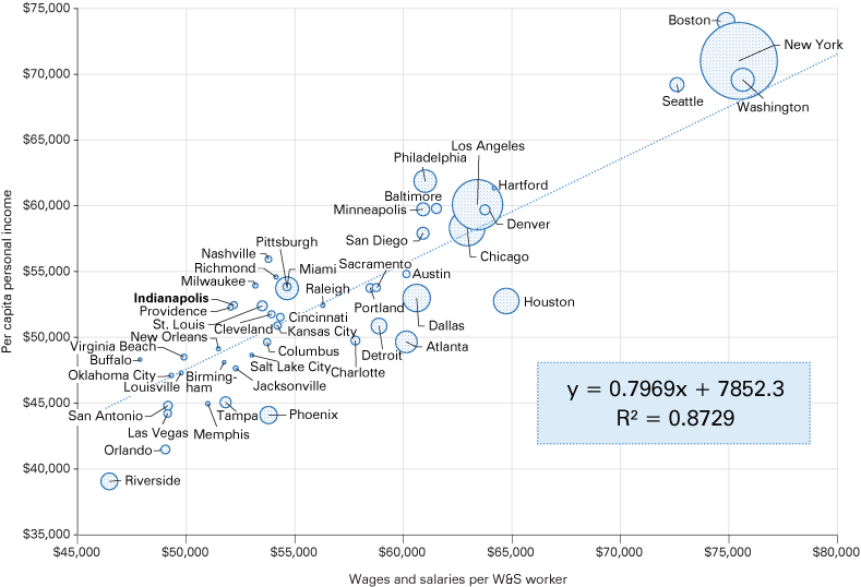
Note: Bubble size is based on MSA population.
Source: IBRC, using U.S. Bureau of Economic Analysis and U.S. Census Bureau data for 2017
Changing geographic boundaries to select states and the U.S as a whole, Figure 2 shows that recent snapshots don’t tell the whole story, or even a portion of the story. Since 1969, wages and salaries have been declining as a proportion of overall PCPI. (Note: Data for 2009 are intentionally omitted from these graphs because it was such an unusual year due to the Great Recession.) What component of PCPI has been rising? Figure 3 shows that for the same selected states, except for Indiana, the proportion of dividends, interest and rent (DIR) to total personal income has been on the rise.
Figure 2: Wages and salaries as a percent of personal income, selected states
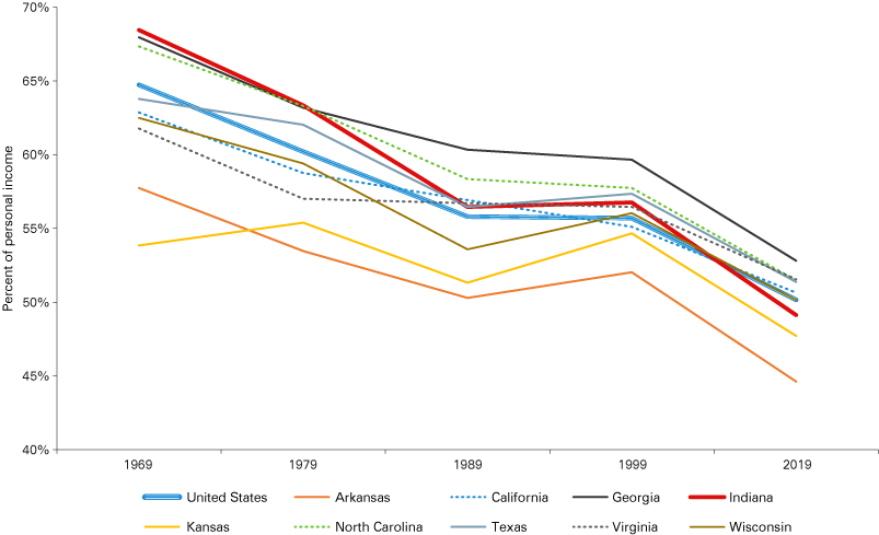
Note: Data for 2009 are intentionally omitted because of the Great Recession.
Source: IBRC, using U.S. Bureau of Economic Analysis data
Figure 3: Dividends, interest and rent as a percent of personal income, selected states
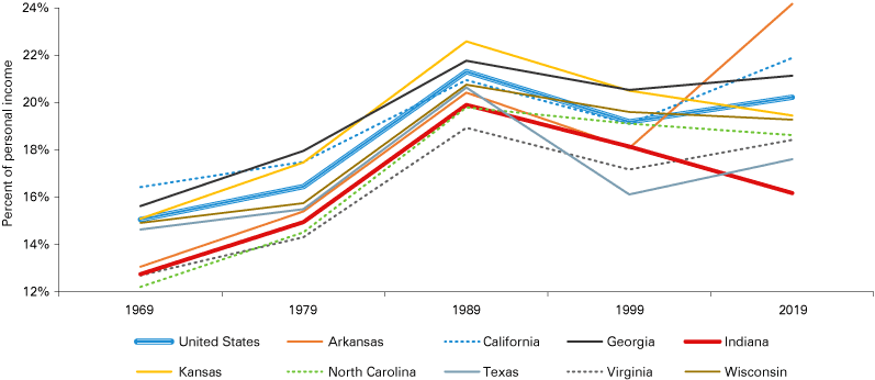
Note: Data for 2009 are intentionally omitted because of the Great Recession.
Source: IBRC, using U.S. Bureau of Economic Analysis data
The structure of income has been changing across the land—sometimes changing drastically. (One suspects that the incongruent shift in Arkansas may have to do with the Walmart effect.) The structural change motivates the question about what generates the income of a population of a region. Generally speaking, wages and salaries appear to be diminishing in importance.
Generally speaking, wages and salaries appear to be diminishing in importance.
This may be a result of the increasing importance of benefits associated with employment, health insurance being the most significant. Were that the case, however, one would expect that W&S would decline as a proportion, but other sources of income would not change dramatically. DIR and transfer payments would be close to flat and the gap between W&S, DIR and transfer payments would be explained by benefits. Yet, the return to capital or asset-based income—DIR—is still on the rise (as are transfer payments). Wages and salaries, benefits, and contributions to retirement are a decreasing proportion of the overall sources of national income relative to DIR.
DIR is what matters. Thus, those regions with relatively high dividend returns from the stock market—those regions with many wealthy retirees, employees with generous retirement benefits or who earn carried interest as hedge fund managers—should be doing well. Those regions with a relatively high proportion of the population earning interest income from bank deposits and bond holdings, as well as regions with a high rate of patenting activity that generates royalties from intellectual property would also be doing better than average. Finally, those regions with high and rising real estate values due to strong demand for homes for well-paid employees or elevated apartment rents because demand outstrips supply will also experience greater-than-average increases in the rent portion in the DIR category.
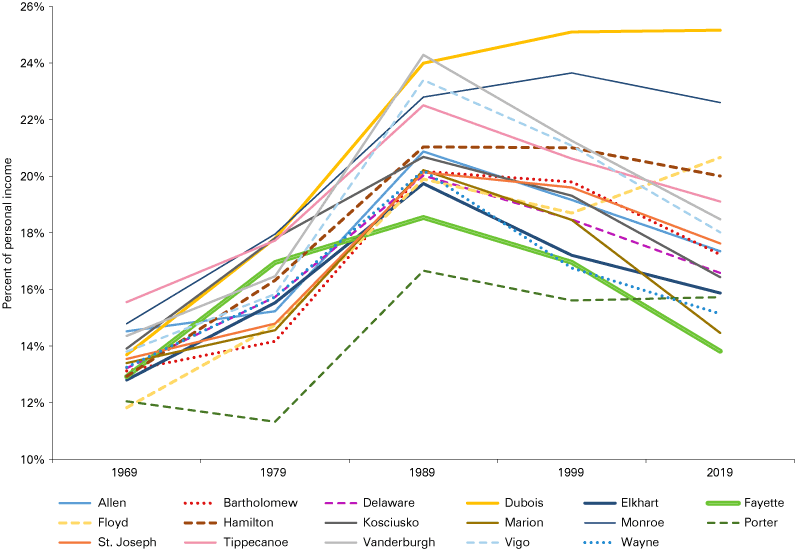
Changes in sources of income tell a story—sometimes an encouraging story. But in many places, like Indiana, the stories are not so encouraging. The following three figures plot the path of W&S, DIR and transfer payments for several selected counties in the state. For all but one county, the stories range from not encouraging to despairing. In Figure 4, only one of the selected counties, Hamilton County, has W&S as a proportion of personal income trended up. The remaining counties have seen the contribution of W&S to overall county personal income on a downward trend. The case of Fayette County is particularly troubling. The county went from being “Little Detroit” in 1969, with its well-paying auto jobs, to almost being a ghost town in the last decade.
Figure 4: Wages and salaries as a percent of personal income, selected Indiana counties
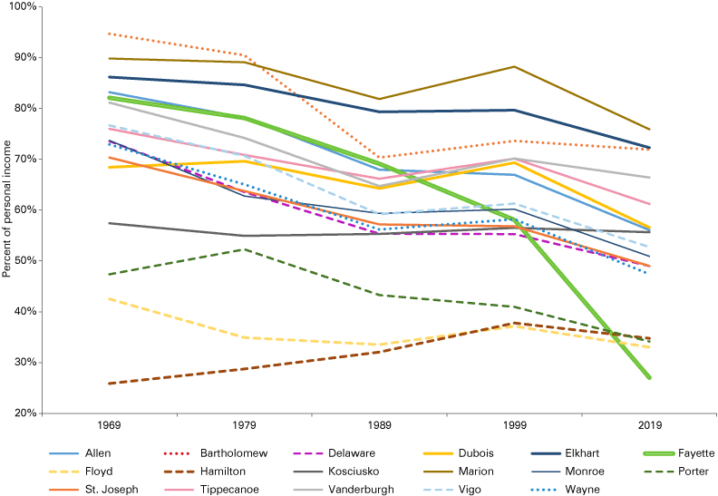
Note: Data for 2009 are intentionally omitted because of the Great Recession.
Source: IBRC, using U.S. Bureau of Economic Analysis data
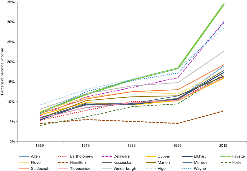
However, as W&S declined as a proportion of income, DIR increased, at least until about 1989. In these graphs, there is an inflection point when the trend changes direction (see Figure 5). Only Dubois County maintained its upward trend of DIR as a proportion of personal income.
Figure 5: Dividends, interest and rent as a percent of personal income, selected Indiana counties
Note: Data for 2009 are intentionally omitted because of the Great Recession.
Source: IBRC, using U.S. Bureau of Economic Analysis data
The real pain point, however, occurs in 1999, when the dependency on transfer income surges, as shown in Figure 6. Having an aging workforce in the process of retiring, especially retiring from fairly well-paid manufacturing jobs and claiming Social Security and pension payments, will drive up the transfer payments component of PCPI. But so will income supplements and unemployment insurance increase the proportion of transfer payments.
Figure 6: Transfer payments as a percent of personal income, selected Indiana counties
Note: Data for 2009 are intentionally omitted because of the Great Recession.
Source: IBRC, using U.S. Bureau of Economic Analysis data
Again, one must be aware that these graphs use snapshot data in 10-year increments so the changes appear more pronounced. The changes in the entire data series from 1969 to 2019 is less abrupt (with the exception of the Great Recession). The data depicted here are not boiling-a-frog graphs—more like scalding-your-hands graphs. The findings are striking. These are the important takeaway points:
- These otherwise boring personal income data do tell a story.
- For a majority of Indiana counties, the story isn’t great. There are structural changes afoot in terms of income sources, and we’d be well-served to determine the forces causing these changes and acknowledge the potential risks to Hoosier well-being.
Measuring which regions are prospering … and those not-so-much
PCPI has been the gold standard for comparing state and regional standards of living. PCPI is measured and reported in the dollars of the day—current dollars. When comparing PCPI between Fort Wayne and Fort Worth, one doesn’t also have to adjust for relative price changes over time. Just the same, knowing that price structures are different place to place, analysts will adjust the PCPI for the cost of living. This is common practice. The Indiana cost of living index (COLI) is 90.3 for the fourth quarter of 2020.3 So to compare Indiana’s PCPI in 2020, one divide’s the Indiana value by 0.9 to provide a better means of comparison with the national PCPI. In the same way, one would divide the Nevada PCPI by 1.09 to adjust it to the cost of living in the Silver State relative to the nation or Indiana.
As one can imagine, the goal is to compare both the number of dollars the populace has to spend and, thus the overall standard of living, together with how far each dollar spends by deflating it or adjusting it for the regional cost of goods, services and other considerations. Some also adjust for differences in tax rates.
What goes into the cost of living index? Depends on who is doing the data collection and how granular—both geographically and product-wise—the analysis is done. Typically, a COLI consists of the cost of groceries, housing, utilities, transportation, health care and miscellaneous (which can include essentials like clothing to nonessentials like sky-diving lessons). At the risk of tipping one’s hand, it should be noted that the different COLI components do not move in unison. They are not in sync. That said, for one cost category, that of housing, the correlation between the cost of housing and the overall cost of living is 0.98 among the 50 states. It is almost as if the rest of the cost categories are redundant, at least for the last quarter of 2020.
How metropolitan statistical areas compare
Given that the change in income sources and structure can tell an interesting story for how states are doing compared to each other in terms of economic performance, and that these changes are also evident in county data as shown within our home state, we may ask ourselves: What do we make of this?
At the risk of being too brief, let us consider data at the metropolitan statistical area (MSA) level and how metro performance may register across PCPI components. Initially, we looked at all MSAs—383 that at the time had consistent data—and found a very strong statistical relationship between PCPI and W&S per worker, which should come as no surprise. The explained variation is 0.62. If using population as the denominator for W&S instead of worker head count, the explained variation is 0.57. The difference in the result is driven by the fact that total wages and salaries are spread among those that are not working, like children and retirees, and not just employees. Figure 7 shows the relationship between W&S per worker and PCPI, with the bubble size based on the MSA population. There are some high performers, such as San Jose, California; Bridgeport, Connecticut; and Naples, Florida. Most of the rank-and-file MSAs—in contrast to those MSAs on economic performing-enhancing steroids—are clustered in the bottom-left quadrant. Those rank-and-file MSAs are our focus for several reasons, one of which is: Why would anyone want to live in San Jose?
Figure 7: Wages and salaries per worker, PCPI and population, all 383 MSAs
Note: Bubble size is based on MSA population.
Source: IBRC, using U.S. Bureau of Economic Analysis and U.S. Census Bureau data for 2017
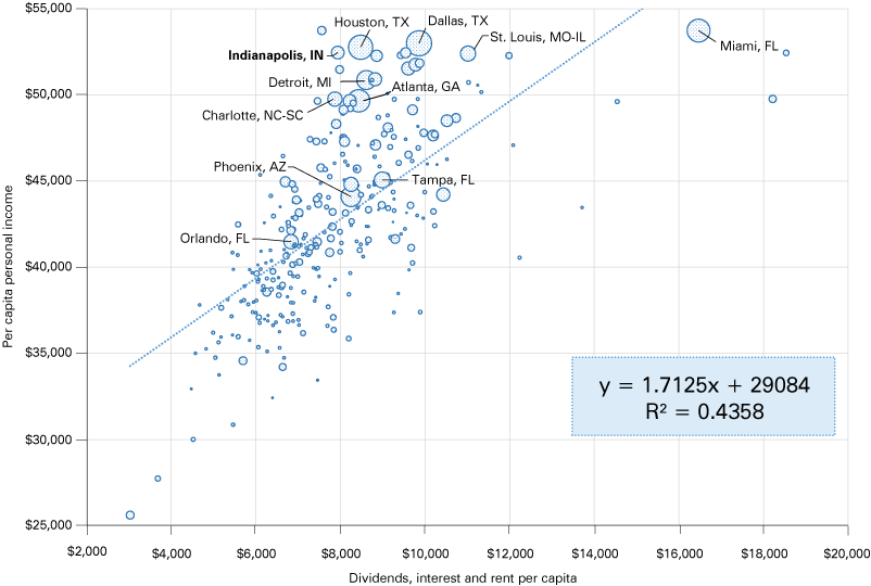
Figure 8 shows the W&S and PCPI relationship among 304 MSAs, the number leftover after trimming the complete 383 MSA set for the economic over-performers, curious outliers and MSAs on statistical steroids. The influence that the 79 MSAs had can be seen in the difference in the explained variation of W&S upon PCPI; the rank-and-file 304 MSA R-squared is 0.46. The explained variation is still respectable for the 304, but the large drop makes one wonder what is driving the performance of the MSAs on statistical steroids. Why are these MSAs so “out there,” as in not clustered with the rest? There are likely many explanations. There isn’t just one factor that drives high PCPI or higher-than-average wages and salaries. For example, regions in Florida with many wealthy retired people will be earning income from their financial assets. Regions with a robust science and discovery sector will likely have significant returns to intellectual capital in the form of patent royalties. And regions with a high cost of real estate—whether from extraordinary demand for housing due to in-migration, or because a region has natural amenities that attract the wealthy to build vacation homes in Jackson Hole, Wyoming or Vail, Colorado—will inflate the rent component of DIR.
Figure 8: Wages and salaries per worker, PCPI and population, 304 rank-and-file MSAs
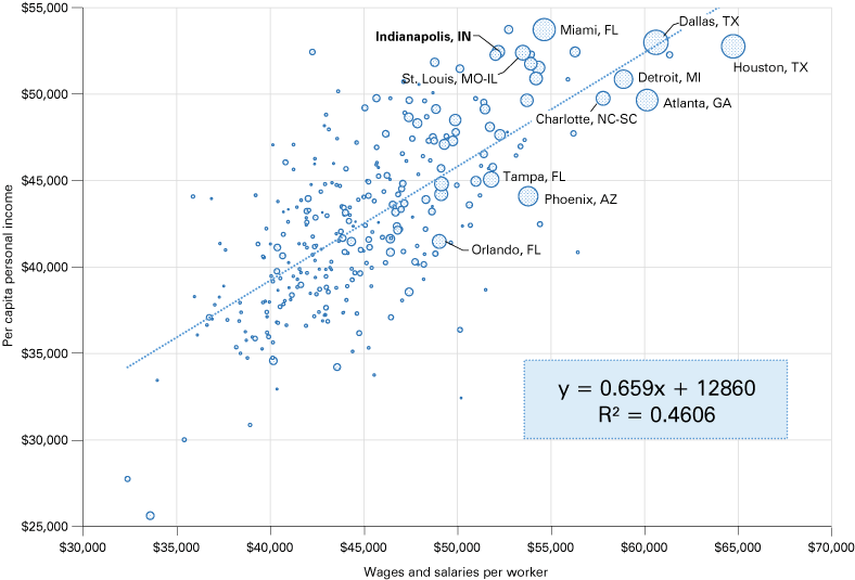
Note: Bubble size is based on MSA population. The 10 largest population metro areas plus Indianapolis are labeled. This graph excludes the metros with the greatest PCPI and W&S per worker.
Source: IBRC, using U.S. Bureau of Economic Analysis and U.S. Census Bureau data for 2017
Addressing all of these factors is beyond the scope of this article, but we will briefly turn our focus to how overly frothy local and regional real estate will tend to drive DIR, and thus, PCPI.
Figure 9 presents the relationship between DIR per capita and PCPI. The explained variation of DIR per capita and PCPI is not quite as great as with wages and salaries, but the 0.44 R-squared is almost on par. DIR may seem like a junk drawer of income sources, but as we have seen in terms of the declining percentage W&S contributes to personal income, the DIR income component is the one to watch into the future, especially the degree to which “rent” drives changes in PCPI. (Now if we could only get a good time series of the four or five categories that comprise DIR.) We turn our attention to how “rent,” in the form of housing costs, may explain the variation in PCPI across regions.
Figure 9: Dividends, interest and rent per capita, PCPI and population, 304 rank-and-file MSAs
Note: Bubble size is based on MSA population. The 10 largest population metro areas plus Indianapolis are labeled. This graph excludes the metros with the greatest PCPI and W&S per worker.
Source: IBRC, using U.S. Bureau of Economic Analysis and U.S. Census Bureau data for 2017
Figures 10 and 11 present the relationship between median home prices, sourced from the U.S. Census Bureau’s American Community Survey, and PCPI for 383 MSAs. Figure 10 shows that median home prices explain about 45% of the variation in PCPI. On the right side of the graph, we see cities with high housing costs, from San Jose at the extreme right where that affordable bungalow is priced around $1.1 million, to the price point of about $400,000 where the graph gets a lot more crowded to the left of that gridline.
Figure 10: Median home values, PCPI and W&S per worker, all 383 MSAs
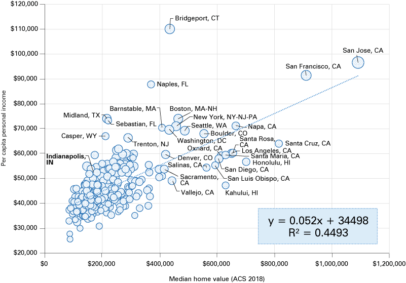
Note: Bubble size is based on wages and salaries per worker.
Source: IBRC, using U.S. Bureau of Economic Analysis (2017) and U.S. Census Bureau (2018 American Community Survey median home prices) data
In Figure 11, we replace PCPI on the y-axis with DIR per capita. The east-west positioning remains the same, but we do see Naples and Sebastian in Florida overtake Bridgeport, Connecticut, on the DIR y-axis. The explained variation for DIR is not as robust—0.29 R-squared—as PCPI as the dependent variable, but this does show a nontrivial relationship between a diverse income construct such as DIR and home values.
Figure 11: Median home values, dividends, interest and rent, and W&S per worker, all 383 MSAs
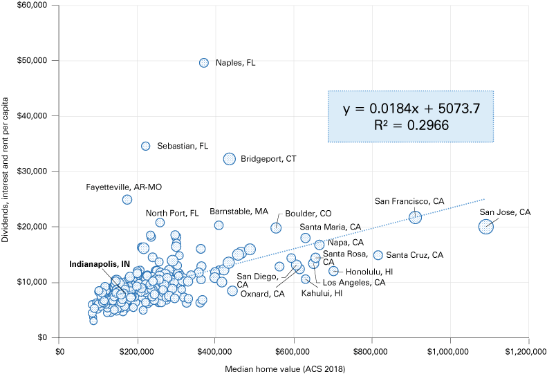
Note: Bubble size is based on wages and salaries per worker.
Source: IBRC, using U.S. Bureau of Economic Analysis (2017) and U.S. Census Bureau (2018 American Community Survey median home prices) data
That returns from financial assets such as stocks, bonds or savings accounts, together with returns from patents and other forms of intellectual property, as well as “rents” on investment properties or owner-occupied housing in the form of imputed rents/returns, are all bundled together in one income category is unfortunate. Just the same, keeping tabs on the dynamics that drive personal income into the future is wise.
Toward a better measure of economic well-being
PCPI for decades has been the go-to metric for assessing economic well-being. The more income, the more spending and the higher standard of living.
We’re not sure that is true anymore. The relationship between paid work—wages and salaries—and PCPI is weakening. Never mind that a policymaker, politician or local economic development practitioner can do little if anything to improve the metric. Over time, the metric as currently constructed, is moving further away from tangible benefits to the populace whom the “Three P’s” are tasked to serve.
For a moment, consider an Indiana governor—of any party—who may see Indiana’s PCPI slowly lose its state ranking (cost of living adjusted or not) over time. He or she might view the PCPI line plateauing as temporary bad luck. But consider how the governor would react to seeing how Indiana’s wages and salaries per capita measure is plummeting in many counties. That governor would want to know why and would want to know how to develop solutions. Different story.
PCPI isn’t as useful as it once was. Increasing wages and salaries per worker isn’t easy, but at least having a growing economy that utilizes increasing levels of human capital per worker and employing more specialized and technical occupations is one avenue to raising earnings, and thus PCPI. In contrast to those days of old, how to raise DIR is almost unknowable today. How does one raise dividends, interest and rent for one’s constituency? And how would that be done equitably so the benefits are widespread?
At the risk of launching an incendiary device or two, here are a few suggestions. One, ditch the PCPI as a measure for general, rank-and-file well-being. Two, in its place, use wages and salaries per capita (WSPC) and track that over time. Three, to measure rank-and-file economic well-being, use the simple measure of dividing median housing prices (or values … we can debate finer points and data sources later) by WSPC (i.e., wages and salaries per capita). Given that housing costs correlate with overall cost of living so closely—0.98 recall—this will provide an estimate of well-being based on earnings and on the cost to live in one place versus another. Also consider that housing costs in the un-absurd regions that are not the Pacific or Atlantic coasts, are about a third of a household’s income. Real estate costs are the 800-pound gorilla in terms of standards of living in the coastal states. This simple measure that any real estate agent or mortgage loan officer uses every day, provides a sense of just how livable a location is.
Others have suggested similar measures, many adjusted dozens of ways to account for nuances. But consider how blunt and lacking nuance PCPI is. Perhaps it is time to change how to run the economic performance score.
Notes
- Credit to author Neal Stephenson for the description of the emerging dichotomy between the physical world we humans inhabit and the digital cyber world.
- Resources on BEA’s website include a wide range of resources on using and understanding its regional statistics, including:
- Glossary—Glossary terms related to state personal income and employment statistics: https://apps.bea.gov/regional/definitions
- Mapping regional statistics: https://apps.bea.gov/iTable/index_regional.cfm
- Previously published estimates mostly for research: https://apps.bea.gov/regional/histdata
- “Cost of living data series,” Missouri Economic Research and Information Center, 2020 Quarter 4, https://meric.mo.gov/data/cost-living-data-series
