
Using simple metrics to quantify development capacity
RED Data Analyst, Indiana Business Research Center, Indiana University Kelley School of Business

Recent large-scale economic development (ED) initiatives like Amazon’s search for “HQ2” have underscored the need for ED practitioners and policymakers to be able to measure their community’s development capacity. The immensity of available data that could be used to do so, however, can be quite overwhelming.
The Indiana Business Research Center’s (IBRC) work with Metrics for Development (M4D) involves collecting relevant data that can be used to gauge a county’s capacity for economic development and packaging it so policymakers, ED practitioners and the public can derive meaningful insights for their communities. M4D, along with its umbrella project Regional Economic Development (RED), will build upon the functionality of StatsAmerica.org, which already provides vast amounts of data.
Methods
The underlying data contain a variety of different scales and sizes, so using the raw numbers could produce misleading results because it would mean measures on a larger scale would, in effect, be weighted more heavily than those on a smaller scale.
A simple min-max method of feature scaling was used to represent all data items on a scale from 0 to 1, where 0 = worst and 1 = best in the United States for any given measure. For those measures that would, in theory, negatively impact development (e.g., poverty rate), the inverse was used. This process ensures the “0 = worst, 1 = best” dichotomy is upheld and makes comparison between the 3,110 U.S. counties straightforward and intuitive.
Given the vastness of the data set (over 70 variables for each U.S. county), 13 indexes were created by adding the relevant measures together and then applying min-max rescaling again. Indexes were built around topics that represent a conventional accounting of development capacity, including human capital, health, industries, population and occupations. More novel indexes that considered less-obvious aspects of capacity, such as commuting and urban sprawl (e.g., means of transportation to work), civil society (e.g., charitable organizations), natural amenities and school financing, were also constructed to paint a comprehensive picture of each county’s development capacity.
Table 1 indicates the variables within each index. Finally, using the 13 indexes, the M4D Index was created for each county to show its overall capacity for social and economic development. When the M4D Index is standardized using the same scheme as above, interpreting which counties are capable of development and which need some work is simple: the county with the greatest development capacity has a standardized M4D value of one, and the county with the least development capacity has a value of zero.
Table 1: Variables in the M4D indexes
| Index | Variable | Inverse? | Source | Food Access | Percent of population that has low access to grocery stores | Y | USDA Food Environment Atlas, 2017 |
|---|---|---|---|
| Percent of population that is low income and has low access to grocery stores | Y | ||
| Grocery stores per capita | N | ||
| Farmers' markets per capita | N | ||
| SNAP benefits per capita | N | ||
| School Funding | Interest on debt per pupil | Y | U.S. Census Bureau Annual Survey of School System Finances, 2016 |
| Long-term debt outstanding per pupil | Y | ||
| Percent of revenue from federal sources | Y | ||
| Percent of total expenditures for current spending | N | ||
| Percent of current spending for instruction | N | ||
| Capital outlays per pupil | N | ||
| Percent of current spending spent on support services | N | ||
| Commuting to Work | Percent of working population that carpooled to work | N | U.S. Census Bureau American Community Survey (ACS) five-year estimates, 2016 |
| Percent of working population that took public transit to work (excludes taxicabs) | N | ||
| Percent of working population that walked to work | N | ||
| Percent of working population that drove to work alone | Y | ||
| Health | Percent of population aged 18-64 that is insured | N | ACS five-year estimates, 2016 |
| Percent of adults that have diabetes | Y | USDA Food Environment Atlas, 2017 | |
| Percent of adults that are obese | Y | ||
| Poor physical health days per month | Y | County Health Rankings, 2018 | |
| Poor mental health days per month | Y | ||
| Years of potential life lost to premature death (age-adjusted) | Y | ||
| Suicide rate | Y | Calculated from CDC Wonder Database, 2016 | |
| Industry Mix | Share of employment in top five traded industries | N | Calculated from BLS Quarterly Census of Employment and Wages (QCEW), 2016; local and traded industry definitions from Porter1 |
| Share of employment in top two local industries | Y | ||
| Ratio of employment in local industries to traded industries | Y | ||
| Share of employment in top three industries | Y | ||
| Share of employment in all local industries | Y | ||
| Creative Class Occupations and Creative Industries | Share of employment in creative class occupations, 2007-11 average | N | USDA Economic Research Service (ERS), 2011, from Florida’s definitions of the creative class2 |
| Share of employment in arts occupations, 2007-11 average | N | ||
| Share of employment in the business services and support industry supercluster (SC) | N | IBRC industry superclusters, 2016 | |
| Share of employment in the tech and knowledge services industry SC | N | ||
| Share of employment in the high intellectual property manufacturing industry SC | N | ||
| Share of employment in the business and other white-collar occupation SC | N | IBRC occupation superclusters from BLS QCEW, 2016 | |
| Share of employment in the manufacturing, technology and engineering occupation SC | N | ||
| Share of employment in the college occupation SC | N | ||
| Share of employment in the arts and entertainment occupation SC | N | ||
| Natural Amenities | Standardized score of January mean temperature | N | USDA ERS Natural Amenities Scale, 1999 |
| Standardized score of January mean sunlight | N | ||
| Standardized score of July mean temperature | N | ||
| Standardized score of July mean humidity | N | ||
| Standardized score of topographical features | N | ||
| Charitable Giving and Civil Society | Itemized contributions as share of total adjusted gross income | N | IRS Statistics of Income, 2016 |
| Intensity of volunteerism | N | NBER from Census CPS, 2013-15 | |
| Non-rent-seeking organizations per 10,000 population | N | IBRC from Penn State’s Northeast Regional Center for Rural Development county-level measures of social capital,3 2014 |
|
| Full-Time Work | Percent of working-age population that works 48-52 weeks per year | N | ACS five-year estimates, 2016 |
| Percent of working-age population that works full-time (35+ hours/week) year-round | N | ||
| Percent of population that didn't work over the past year | Y | ||
| Percent of population that works part-time (less than 35 hours a week) | Y | ||
| Crime | Violent crime events per 1,000 population | Y | FBI Uniform Crime Reporting Data Series, 2014 |
| Property crime events per 1,000 population | Y | ||
| Jobs, Earnings and Productivity | Employment growth, 2001-2016 | N | IBRC from U.S. Bureau of Economic Analysis, 2016 |
| Average earnings per worker growth, 2001-2016 | N | ||
| GDP per worker growth, 2001-2016 | N | ||
| Per capita income growth, 2001-2016 | N | ||
| Poverty rate | Y | ACS five-year estimates, 2016 | |
| Literacy and Education | Percent of population 16 and older not lacking basic prose skills | N | Calculated from NCES National Assessment of Adult Literacy, 2003 |
| Percent of population 25 and older that have completed more than 8th grade | N | ACS five-year estimates, 2016 | |
| Percent of population 25 and older with a high school diploma or equivalent | N | ||
| Percent of population 25 and older with at least a bachelor's degree | N | ||
| Population Dynamics | Population growth, 2010-2016 | N | ACS five-year estimates, 2016 |
| Population density | N | ||
| Net migration rate | N |
Source: Indiana Business Research Center
View county-level nationwide maps of these indexes in the appendix.
Nationwide findings: A rising tide lifts all boats
A good way to start exploring these data is to look at the differences between the highest-and lowest-scoring counties in the United States. Figure 1 shows the makeup of the raw (i.e., non-standardized) M4D indexes for the five highest- and lowest-scoring counties. You can see that the five counties at the low end of the spectrum are penalized for their scarcity of job opportunities, low earnings and productivity, poor health, and lack of school systems. Ziebach County, South Dakota, also suffers from remarkably high crime: Its Crime Index is 0, meaning it has the highest crime per capita in the country. For 2014 (the latest year of data available), the FBI reported 284 property crimes per 1,000 people and an astounding 215 violent crimes per 1,000 people. For context, the next closest county is Lincoln County, West Virginia, with 218 property crimes and 39 violent crimes per 1,000 people.
Figure 1: Top five and bottom five U.S. counties by M4D score
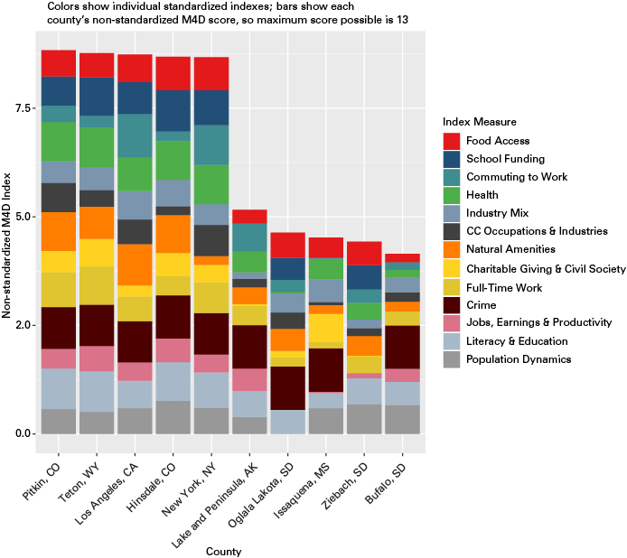
Note: Lake and Peninsula, Issaquena and Buffalo counties are served by school districts based in neighboring counties, so the school funding measure = 0.
Source: Author’s calculations
What exactly is so different between the counties at the low end and the high end? To investigate this question, the counties with M4D scores above and below two standard deviations from the mean—a total of 158 counties—were isolated and statistics were compared for nearly 200 variables, some of which were included in the indexes and some of which were not. Table 2 shows a small selection of these.
Table 2: Comparison of selected variables between highest- and lowest-scoring counties by M4D Index
| High- or low-scoring?* | Median rural-urban continuum code (1-9)** | Average percent of tax returns with business or professional income | Average population growth, 2010-2016 | Average net migration rate, 2001-2016 | Average employment growth, 2001-2016 |
|---|---|---|---|---|---|
| High | 4 | 20.4% | 3.8% | 0.2% | 1.0% |
| Low | 7 | 16% | -3.1% | -1.6% | -0.3% |
| High- or low-scoring? | Average ratio of business openings to closings | Average percent with a bachelor's degree or higher | Average percent with a high school diploma | Average percent age 18-64 with health insurance | Average per capita income growth, 2001-2016 |
| High | 1.27 | 24.0% | 88.7% | 85.2% | 4.0% |
| Low | 1.17 | 7.7% | 74.0% | 72.7% | 3.4% |
| High- or low-scoring? | Average violent crime events per 1,000 population | Average property crime events per 1,000 population | Average percent of households headed by single parents | Average percent of K-12 revenue from local sources | Average long-term K-12 debt outstanding per student |
| High | 1.76 | 15.53 | 22.7% | 58.5% | $8.80 |
| Low | 5.62 | 24.78 | 49.5% | 27.0% | $16.50 |
* The “High” group includes 77 counties and the “Low” group includes 81 counties.
** The RUCC scores each county by its relative rurality and proximity to urban areas, with 1 being most urban and 9 being most rural.
Source: Author's calculations, from USDA Economic Research Service, IRS Statistics of Income, 2016; ACS five-year estimates, 2016; BLS QCEW, 2016; County Business Patterns, 2016; FBI Uniform Crime Reporting Data Series, 2014; and Annual Survey of School System Finances, 2016
The variables with the largest discrepancies between the lowest- and highest-scoring counties include net migration rate, population growth from 2010-2016, all of the natural amenities variables, employment growth from 2001-2016, the percent of residents with obesity and diabetes, crime, venture capital investments, poverty, the percent of residents with a bachelor’s degree, and the percent of residents who reported not working over the last year.
The lowest-scoring counties exhibit several characteristics that are contributing to the divergence, including:
- Low human capital (e.g., “brain drain”)
- Low natural amenities
- Poor health
- Lack of business investment
- Low labor force participation
- High crime per capita
- Poor economic conditions
We sort of run into a “chicken or the egg” problem here: Are educated people not coming to these counties because they lack development capacity, or do they lack development capacity because educated people don’t live there? The same could be said for many of the variables in the data set. Those questions remain unanswered.
But what can be said definitively is that there are material differences between the counties at the low and high ends of the spectrum that may be contributing to disparate economic outcomes and development capacity. Of the broad characteristics mentioned above, county officials are likely best equipped to improve the low labor force participation problems through increased investment in workforce training programs and, even more importantly, re-training programs for workers displaced by automation.
A new report by the Brookings Institution notes that small towns and small metros, as well as rural areas—many of which fall on the low end of the spectrum in this analysis—are far more likely to suffer from job losses due to automation in the coming years, which makes education, re-training and skill development all the more vital for these counties.4
Combating brain drain, though no easy endeavor, would do a great deal to improve other characteristics that could be contributing to meager development capacity in the lowest-scoring counties. Enticing more educated people to a community—and improving the skills and education of residents already living there—could raise health outcomes, attract new businesses (and jobs), reduce crime and expand the economy overall.
It is worthwhile to consider the 13 indexes separately and assess their relative impacts on desired outcomes. Using a linear regression of each of the indexes on the ratio of establishment births (openings) to total establishments (a common measure of entrepreneurship), we can see which index has the greatest relative impact on new business development.
The indexes with the greatest relative positive impact on this measure—meaning they were statistically significant and had the largest positive coefficients in the regression equation are:
- Jobs, Earnings and Productivity
- Literacy and Education
- Population Dynamics
That these indexes are statistically significant provides additional support for the hypothesis that investments in human capital, such as education and job training, will likely improve other outcomes not directly related to human capital development. Furthermore, positive correlation coefficients between the Literacy and Population (0.2), Literacy and Jobs (0.27) and Literacy and Health (0.63) indexes indicate that a rising tide may indeed lift all boats.
Surprisingly, the School Funding, Industry Mix, Creative Class Occupations and Industries, and Food Access indexes have statistically significant negative coefficients, meaning they have a negative impact on the ratio of establishment births to deaths. It should be noted, however, the indexes only explained 15 percent of the variation in the dependent variable, implying that unobserved factors are also affecting business start-ups.
Indiana is well situated for economic development, but automation is a looming threat
Figure 2 shows the geographic distribution of standardized M4D scores in the state of Indiana. (The standardization is based on all U.S. counties, not just those in Indiana, which is why the scores max out around 0.75 and not 1.) Higher scores seem to be concentrated near metro areas, like around Indianapolis, Fort Wayne, Evansville and Bloomington, though this isn’t true in all cases. Hamilton County has the highest M4D score, 0.74 (raw score of 7.62 out of 13), and Switzerland County has the lowest, 0.49 (6.42).
Figure 2: Indiana’s M4D scores
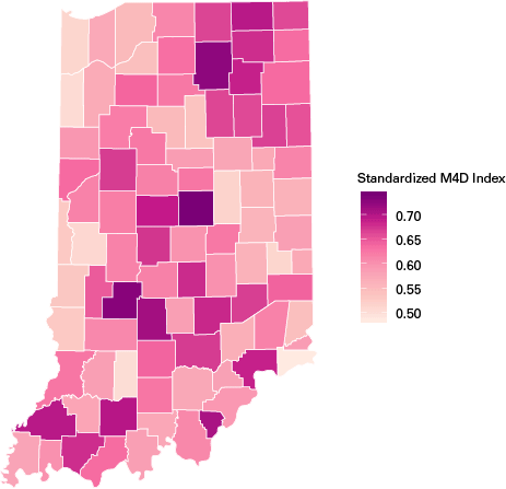
Source: Author's calculations
You could say that Indiana is fortunate: The score of our lowest county is relatively close to the middle of the pack for the entire country. This implies strong development potential across the state overall, especially in cities like Carmel, Bloomington, New Albany, Greenwood and Elkhart, and even smaller communities like Madison, Warsaw, Spencer and Jasper. Some regions are lagging behind, however, especially those along the Illinois and Ohio borders and near Chicago.
Figure 3 is the same idea as Figure 1 but just for Indiana counties. Right off the bat, you may notice that the separation between the high and low ends of the spectrum is much lower in Indiana than in the United States as a whole. This indicates Indiana is well suited for economic development overall.
Figure 3: Top five and bottom five Indiana counties by M4D score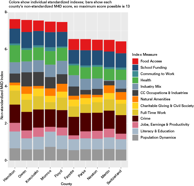
Source: Author’s calculations
The main factors contributing to low scores for the bottom five counties seems to be a low mix of industries (especially for Martin County), low concentrations of creative class occupations and creative industries, and relatively low natural amenities. The higher-performing counties have a greater concentration of CC occupations and industries, better health and are more highly educated, especially in Hamilton and Monroe counties.
But there’s a wrinkle in this relatively good news: The risk of automation threatens Indiana more than any other state, according to the Brookings Institution report mentioned above. Due in part to the state’s manufacturing roots, the authors of the report conclude that about 49 percent of the average Indiana worker’s tasks are potentially automatable, which is higher than any other state.
When they break it down by metro area, several Indiana metros top the list, including Kokomo, Elkhart-Goshen, Michigan City-La Porte, Terre Haute and Columbus. See Table 3 for a list of Indiana metros at highest risk of automation. Practitioners and public officials in these metro areas—though they certainly can’t do it alone—must be proactive and take action to limit the distress of worker displacement due to automation.
Table 3: Indiana metros at greatest risk of automation
| Rank (out of all U.S. metros) |
Metropolitan area | Average automation potential | "Low risk" job share |
"Medium risk" job share |
"High risk" job share |
|---|---|---|---|---|---|
| 2 | Kokomo | 54.7% | 28.8% | 33.0% | 38.2% |
| 3 | Elkhart-Goshen | 54.6% | 25.9% | 38.1% | 36.0% |
| 13 | Michigan City-La Porte | 51.0% | 30.3% | 38.5% | 31.2% |
| 21 | Terre Haute | 50.6% | 32.4% | 37.9% | 29.7% |
| 24 | Columbus | 50.3% | 33.1% | 35.8% | 31.1% |
| 30 | Lafayette-West Lafayette | 50.1% | 35.5% | 37.7% | 26.8% |
| 51 | Evansville | 49.4% | 34.0% | 36.0% | 30.0% |
| 67 | Fort Wayne | 48.9% | 34.9% | 35.6% | 29.5% |
| 73 | Muncie | 48.7% | 36.5% | 35.7% | 27.8% |
Note: Averages weighted by occupational employment share. Automation potential refers to the share of tasks in an occupation that could be automated with current technologies. "Low risk" jobs are those for which 30 percent of tasks or less are potentially automatable, "medium risk" are those with between 30-70 percent of tasks automatable, and "high risk" are those with over 70 percent of tasks automatable.
Source: Brookings Institution analysis of BLS, Census, EMSI, Moodys and McKinsey data
Limitations
This analysis has several limitations. The selection of variables was subjective, as different researchers are likely to have different priorities. Perhaps they may choose to employ a more sophisticated and objective method for selecting variables, such as factor analysis. The motivation for setting up the analysis this way was mainly simplicity—but simplicity has its drawbacks.
Arguments could be made that, for example, charitable giving and how people commute to work aren’t important for measuring development potential. Such arguments may be valid, and perhaps an analytical strategy that weighted some indexes more heavily than others would’ve been appropriate. This analysis didn’t cover everything either, which is why we prioritize making the data available on StatsAmerica so users can conduct their own analyses.
Conclusion
Regardless of any limitations, the findings are relevant to economic development practitioners and local officials. I show that brain drain—low levels of education and literacy, population loss, low funding for public education, low labor force participation, etc.—could be contributing to poor economic and social outcomes and, in turn, limits development capacity in the low-scoring counties. The implication of this is that investments in human capital—funding apprenticeships, making higher education more accessible, implementing displaced worker re-training programs, etc.—may alleviate other ills that disadvantage struggling communities.
Additionally, the looming threat of automation should be a concern for county leaders and policymakers, especially in Indiana. Investments in worker re-training programs aimed at those displaced by automation must be part of a comprehensive strategy on the local, state and national levels that views automation not as a threat but as an opportunity to enhance productivity and improve workers’ lives.
How can ED practitioners and policymakers apply the findings of this analysis to assess their development capacity and improve economic outcomes for their communities? The most obvious application is benchmarking against other counties that are in close proximity or exhibit similar characteristics. This functionality is planned for the rollout of REDWeb on StatsAmerica.org—not just with M4D but with a wide range of data.
This functionality would allow practitioners to assess their communities’ strengths and weaknesses across the 13 indexes and consider ways to improve their capacity for development. Moreover, as a part of RED, we intend to produce computational models for users to interact with and test the efficacy of potential development strategies. The combination of models and M4D will be a valuable resource for officials to plan for and manage development in their communities.
View the appendix for U.S. county-level maps.
This article was prepared by the Trustees of Indiana University using Federal funds under award number ED17HDQ3120040 from the U.S. Economic Development Administration, U.S. Department of Commerce. The statements, findings, conclusions, and recommendations are those of the author(s) and do not necessarily reflect the views of the Economic Development Administration or the U.S. Department of Commerce.
Notes
- Porter, M. E. (2003). The economic performance of regions. Regional Studies, 37, 549-578.
- Florida, R. (2002). The rise of the creative class. New York: Basic Books.
- Rupasingha, A., Goetz, S. J., & Freshwater, D. (2006, with updates). The production of social capital in US counties. Journal of Socio-Economics, 35, 83–101. doi:10.1016/j.socec.2005.11.001.
- Muro, M., Maxim, R. and Whiton, J. (2019). Automation and artificial intelligence: How machines are affecting people and places. The Brookings Institution.

The Indiana Business Review is a publication of the Indiana Business Research Center at Indiana University's Kelley School of Business. Permission to use the material is encouraged, but please email us at ibrc@iu.edu to indicate you will be using the material and in what other publications. Privacy Notice