Finding New Cheese: Why Indiana’s Per Capita Personal Income Lags (and How to Fix It)
Director of Economic Analysis, Indiana Business Research Center, Indiana University Kelley School of Business
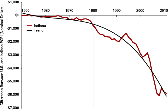
There has been a lot of hand wringing about Indiana’s per capita personal income (PCPI) not only lagging the nation, but that the gap between the two continues to widen. Figure 1 tells the grim tale. Except for a brief recent uptick in 2009 and 2010 that resulted in the recovery in manufacturing outpacing the recovery in other sectors of the national economy—and the upticks following the recessions in 1991 and 2002 can also be explained this way—the overall trend is disheartening. While holding its own compared to the nation as a whole through the 1950s and 1960s, Indiana started losing ground in the 1970s. But it was the 1980s, when manufacturing was being hollowed-out with nothing to replace it, when the slide accelerated (see Figure 1).
Figure 1: History of the Gap Between Indiana’s PCPI Compared to the Nation, 1950 to 2011
Source: IBRC, using Bureau of Economic Analysis data
Despite his best efforts, former Governor Daniels was unable to reverse the trend. While one may fault him for choosing a headline measure—PCPI—that is brutally difficult to change and for which we would judge his policies and initiatives, his administration helped craft a business-friendly environment in the state. The trouble is, this didn’t help generate the number and type of jobs that would favorably move the PCPI needle.
An IBR article from 2010, “Occupational Hazard: Why Indiana’s Wages Lag the Nation” posits that to close the PCPI gap, Indiana needs to change its occupational mix.1 Adding traditional manufacturing jobs, as desirable as they are, just won’t close the gap. The compensation for these jobs hovers around the state’s average pay, although many advanced training and educational credential jobs are well paid. In order to close the PCPI gap, Indiana needs jobs that pay well above the average.
This article makes the same point, but using different data. The “Occupational Hazard” article focused on the Midwest, while this analysis looks at national trends.
In broad strokes, the jobs that Indiana needs tend to be in occupations that require higher levels of educational attainment. Indiana has a troubling lower concentration of occupations associated with headquarters (running businesses), design and engineering, and high tech.
The Relationship Between Educational Attainment and PCPI
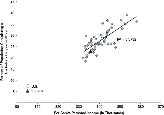
It is no wonder that Indiana’s PCPI lags the nation. We also lag the nation in terms of educational attainment. In 2011, Indiana ranked 43rd in the country in terms of the percent of the population holding a bachelor’s degree or higher.2 Indiana’s nearest neighbors in the education department are Nevada and Alabama, ranking 44 and 45, and Tennessee and Oklahoma, ranking 42 and 41, respectively.
As Figure 2 shows, there is a strong correlation between educational attainment and PCPI.
Figure 2: Relationship Between Educational Attainment and PCPI, 2011
Source: IBRC, using Census Bureau and Bureau of Economic Analysis data
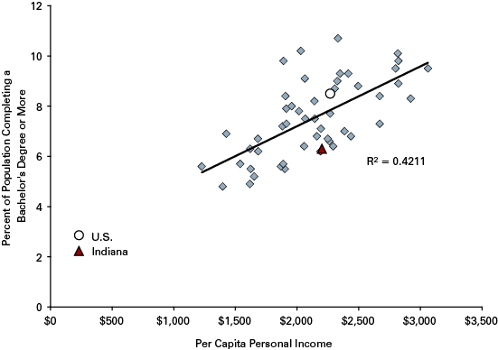
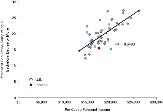
This relationship—greater educational attainment and income—has also gotten stronger over time. Figures 3 and 4 show the relationship—the R-squared that measures the degree to which the variation in PCPI can be explained by educational attainment.
Figure 3: Relationship Between Educational Attainment and PCPI, 1960
Source: IBRC, using Census Bureau and Bureau of Economic Analysis data
Figure 4: Relationship Between Educational Attainment and PCPI, 1990
Source: IBRC, using Census Bureau and Bureau of Economic Analysis data
The strength of the relationship built steam over time from 0.42 in 1960 to 0.62 in 2000. The 2011 R-square of 0.57—a slight interruption in the march of educational attainment as the key driver in PCPI—can probably be attributed to the economic downturn and many college graduates being underemployed. The trend for all the states has been toward higher and higher achievement; overall, the nation improved by 20.8 percentage points from 1960 to 2011. Massachusetts, the state with the second-highest positive difference compared to the county, improved more than 30 percentage points over the same period. Indiana’s educational attainment improved a mere 16.7 percentage points, 40th among the states.
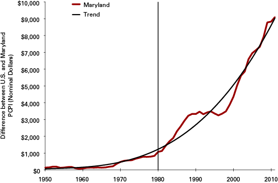
The state of Maryland provides an intriguing contrast to Indiana. In 1960, 9.3 percent of Maryland’s population had completed a bachelor’s degree or more, while in Indiana, the statistic was 6.3 percent. (The national average was 7.7 percent in 1960.) By 2011, Maryland had increased its level of educational attainment by 27.5 percentage points, to 36.8 percent, the second-highest gain in the county. Maryland’s performance in PCPI growth is an inverse of Indiana’s. Figure 5 is in stark contrast with Figure 1.
Figure 5: History of the Gap Between Maryland’s PCPI Compared to the Nation, 1950 to 2011
Source: IBRC, using Bureau of Economic Analysis data
It would seem clear that the educational attainment of the population is driving the tale of two Americas.
What We Do Affects How Much We Earn
The established wisdom is that innovation drives economic growth. Developing new and differentiated products and services is where the money, and jobs, are. Producing undifferentiated goods—commodities like uniform agricultural products—doesn’t pay as well.
The Indiana Business Research Center, supported by a grant from the Economic Development Administration, developed an innovation index to measure a region’s innovation capacity. The index is an amalgam of components that are thought to contribute to innovation. It made sense to test a few of the components—high-tech employment or STEM-related graduates, for example—to see if there were any relationships between these innovation measures and PCPI. Figures 6 and 7 show the relationship between high-tech employment and science and engineering graduate students with respect to PCPI. Here we see the generally positive influence that high-tech and science and engineering have on a state’s economy.
Figure 6: Relationship Between High-Tech Employment (2009) and PCPI (2011)§
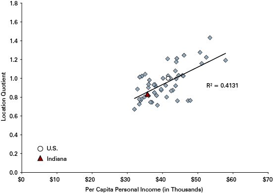
§ All analysis and presentation used 2011 PCPI for consistency. The high-tech employment component is the most recent year these data were available on the Innovation Index website.
Source: IBRC, using Innovation Index and Bureau of Economic Analysis data
Figure 7: Relationship Between Science and Engineering Graduate Students (2008) and PCPI (2011)
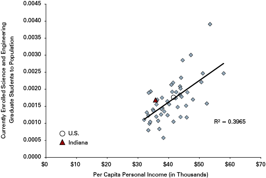
Source: IBRC, using National Science Foundation and Bureau of Economic Analysis data
The concentration of any particular occupation in a state will affect that state’s PCPI.3 This was one take-away from the aforementioned “Occupational Hazard” article. Figure 8 provides another glimpse into this phenomenon. The location quotient (LQ) measures the relative concentration of employment (in this case) relative to the nation. The national LQ is, by definition, one. An LQ below one shows that the concentration is below the nation and an LQ above one indicates that employment is more concentrated than the national average. Thus, by way of example, Virginia has an LQ of two for computer and mathematical occupations, meaning that the state has twice as many workers in this occupation relative to the nation.
Figure 8: Positive Relationships Between Occupational Concentration and PCPI, 2011
 Source: IBRC, using Bureau of Labor Statistics and Bureau of Economic Analysis data
The fact that arts, design, entertainment, sports and media occupations show a relatively strong and positive correlation with PCPI makes one wonder if Richard Florida, and his theory about the creative class, isn’t on to something.
The bad news for Indiana, and expanding upon Indiana’s traditional strengths, is that production and transportation occupations have a negative effect on PCPI. The greater the concentration of occupations related to manufacturing, the lower the PCPI (see Figure 9).
Figure 9: Negative Relationships Between Occupational Concentration and PCPI, 2011

Source: IBRC, using Bureau of Labor Statistics and Bureau of Economic Analysis data
The explanatory power, R-square, is not jaw dropping great, but one must realize that these occupation categories are comprised of dozens of particular narrowly defined occupations and many of the occupations within each broad category are paid well. This dilutes the explanatory power of the major occupational groupings.
One peculiar case is the major occupation category of architecture and engineering occupations. This major category group does not have the robust positive effect on PCPI. As shown above, science and engineering graduate students have a relatively strong beneficial effect on PCPI. What is the disconnect? There is no strong evidence to make an unequivocal statement. While Indiana, for example, has a greater proportion of technicians who tend to earn less than full-scale engineers than say Michigan, Massachusetts and Maryland, these differences are not sufficient to explain the lack of a strong relationship between architecture and engineering occupations and PCPI. That said, Indiana can boast a relatively high LQ for biomedical engineers and, compared to other engineering occupations, that has a relatively strong relationship with PCPI. Indiana even bests the LQ of both California and Massachusetts for biomedical engineers. Unfortunately, those two states crush Indiana’s LQ in computer hardware engineers, another engineering occupation with a positive relationship with PCPI.
A Note on the Cost of Living
All of this analysis is reported in nominal dollars. While the lower cost of living in places like Indiana or South Carolina stretch the state’s paychecks, the question about whether cost of living drives the level of wages or if the wages drive the cost of living from state to state is an open one. Offering higher wages to attract talent puts demand pressure on resources in relatively scarce supply, real estate in particular. Real estate, or more specifically, the cost of housing, tends to swamp other components of the cost of living in the high-cost regions.
If one could deploy a good historical cost of living index by state, it would show that the “real” income gaps between states are smaller.4 But the gaps would still exist and there would still be a positive relationship between higher levels of educational attainment and PCPI growth. Stated another way, even if one inflated the Indiana PCPI to account for the lower cost of living compared to California or Maryland, there would still be an income gap and that gap would still be explained by—spoiler alert—education, industry mix and occupational mix.
What We Make Affects How Much We Earn
The prior section focused on the relationship between PCPI and the occupational concentration across states. The focus now turns to industries and the concentration of employment by industry, also as measured in terms of LQs.
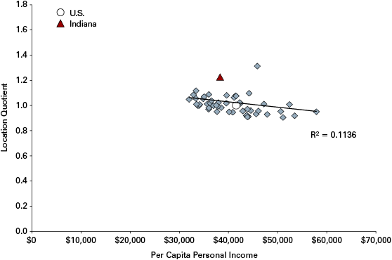
Certain industries, like retail, don’t correlate positively with higher levels of PCPI (see Figure 10). The retail industry is not going to be a major force in elevating PCPI for two reasons. One is fairly obvious: retail jobs don’t pay exceedingly well. With a couple of exceptions (like pharmacists working at drug stores), most retail jobs do not require advanced or specialized training.
Figure 10: Relationship Between the Retail Trade Industry and PCPI, 2011
Source: IBRC, using Bureau of Economic Analysis data
The second probably makes intuitive sense, although the term may confuse. Even though the industry is often called “the retail trade,” the industry is not “traded” in an economic sense. Manufactured goods and natural resources are considered in the “traded sector” because the local population does not use much if any of the production. A vast majority of transmission plant output isn’t consumed locally. The output is traded for other goods and services, like carpet from Georgia or neck ties from Italy. The need for workers at the transmission plant isn’t dependent upon the local population consuming gears; the need for workers depends on how many cars are sold elsewhere. For sectors like retail or health care, the demand is based on local demand that is closely aligned with local population counts.
So the second reason that retail isn’t going to drive PCPI by a great deal is that the industry, like health care, is fairly evenly distributed across all regions and states. There isn’t a wildly different number of shop keepers relative to the population in one state as opposed to another. Just the same, health care employment is going to be driven by a region or state’s population—the number of doctors is a function of the number of patients—so the concentration of health care workers across states is very similar.
These two reasons explain both why the relationship between retail trade and PCPI is negative (downward sloping) and why the state LQs are bunched around the national average of one. The one curious outlier with an LQ of 1.3 and middling income is New Hampshire, a state with no sales tax, and a state increasingly harboring higher income, erstwhile Massachusetts residents fleeing high taxes. (New Hampshire also has no income tax.)
The industries that have a positive effect on a state’s PCPI tend to follow the high-tech trends (see Figure 11). Information, for example, has a relatively high explanatory power, as does finance and insurance and professional, technical and scientific services. The latter has the greatest positive explanatory power of those industry groupings. Also in this league is education services. Unfortunately, these industries (with the exception of education services) are not well represented in Indiana. Employment concentration in education services is about 95 percent of the national average. Employment in finance and insurance is about 75 percent of the national average, while employment concentration in the industries of information and professional, technical and scientific services are about 65 percent of the U.S. average.
Figure 11: Positive Relationships Between Industry Concentration and PCPI, 2011

Source: IBRC, using Bureau of Economic Analysis data
One might be tempted to say that this article is cherry picking the industries chosen to report, and to some degree, that is correct because space does not allow for providing figures for all occupations and industries. As a result, only those at the top and bottom of the correlation and R-square list are presented. It just so happens that the industries that Indiana is relatively weak in are those very industries that help to raise a state’s PCPI.
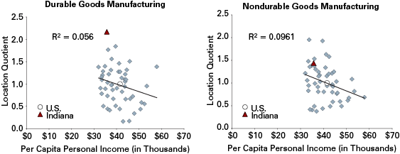
Conversely, it also happens that those industries that Indiana is relatively strong in are those that tend to pull down a state’s PCPI. Having already mentioned the retail industry (Indiana has an LQ of 1.03) as one that tends to pull down a state’s PCPI, two other industries that dominate the Indiana economic profile also tend to pull PCPI down. Indiana has an LQ of 2.17 in durable goods manufacturing—the highest in the nation—and 1.44 for non-durable goods manufacturing. As Figure 12 shows, the relationship is negative. The not-as-bad-news is that the explanatory power of the relationship is not as strong as with those industries that exert positive pressure on the PCPI.
Figure 12: Relationships Between Manufacturing Concentration and PCPI, 2011
Source: IBRC, using Bureau of Economic Analysis data
For those who may want to emphasize the importance of advanced manufacturing contributing to rising PCPI may well use the state of Connecticut as an example, the state with the highest PCPI in the country. With Pratt & Whitney and Electric Boat, the state produces an array of sophisticated manufactures. Connecticut has a respectable durable goods manufacturing LQ of 1.38 (Connecticut also has the second-highest LQ in finance and insurance, after Delaware).
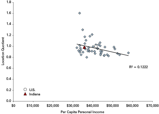
The other industry that tends to put negative pressure on PCPI is the miscellaneous collage of personal service, laundry, household employees, repair and maintenance workers call “other services” (see Figure 13).
Figure 13: Relationship Between “Other Services” Concentration and PCPI, 2011
Source: IBRC, using Bureau of Economic Analysis data
A Brief Excursus on Manufacturing
Right about now, the reader may expect a rant about the need to let manufacturing slowly die and focus on growing science and engineering jobs in the state. Initiatives to attract and develop the research and design functions of manufacturing firms—that is, the higher value added activities compared to component manufacturing—would make eminent sense. After all, who is getting rich working for Apple: The laborers in China assembling the i-gadgets or the designers in California engineering the i-gadgets? Who is better paid, the engineers in Michigan designing and testing new engine technology, or the assemblers putting those engines together?
That said, letting manufacturing wither away doesn’t make sense either.
The reason for this gets back to the above discussion about the “traded sector.” Keeping manufacturing healthy—which means adapting to meet the needs of increasingly sophisticated production—is vital. Companies in traded sectors are the locomotives creating demand for the local or regional non-traded sector jobs. Manufacturers employ workers who, in turn, need contractors to remodel their kitchen, mechanics to repair their cars, beauticians to highlight their hair and restaurateurs to make their lunches.
From mom-and-pop bait shops to chain grocery stores, these establishments support local parts suppliers, maintenance and repair services, transportation companies, and design firms that then expand their businesses, driving yet more consumer spending. The traded sector workers, in effect, employ the non-traded sector workers. Put another way, Toyota won’t site a plant because there is a Home Depot nearby. But Home Depot will certainly consider locating a store in a town that just opened a 1,800 worker auto plant.
One can’t have a healthy economy without a robust globally traded sector. Manufacturing, as it happens, is America’s most important traded sector. Firms in the traded sector make up about one-third of the U.S. economy. These companies compete internationally, as well as domestically across regions, and this competition is different from that in the non-traded, local sector. If an electronics retailer goes out of business locally, another competitor will fill the vacuum, be it a brick and mortar store or Internet vendor. If a meat-packing plant shutters its doors, what will fill the vacuum locally? The answer is: probably nothing. The vacuum will remain. It might be interesting to note that the reason that so many brick and mortar retailers like Best Buy are having such difficulty is that the landscape of what constitutes the traded sector has changed. Best Buy has operated like it is in the non-traded sector, but Amazon operates like it is in the traded sector.
Indiana, as a historically manufacturing-intensive state, recognizes the vital importance of the traded sectors. If the state can’t compete in markets and sell products beyond its borders, Hoosiers won’t have jobs and its economy would shrivel. In fact, this is exactly what happened as the state’s manufacturing sector lost jobs even as the national economy was expanding from 2002 to 2007.
All this to say, manufacturing is still important—but not “your father’s manufacturing.” The manufacturing of the future will require more than re-tooling. It will require new tools and a new labor force to match.
What Is to Be Done?
Indiana’s PCPI performance is both disappointing and, if current trends continue, will regrettably only get worse. Developing the perfect policy and program responses will take a lot more than presenting several graphs and noting trends, but a course correction is in order. Before presenting the broad outline of what that course correction might look like, here is a review of defining elements of the national and Hoosier economy:
-
Educational attainment is a key driver in rising incomes.
- The occupational concentration of a region or state accounts for differences in incomes.
- A high concentration of production occupations tends to lower PCPI.
- A high concentration of high-tech and business occupations tends to raise PCPI.
- A state or region’s industry mix accounts for differences in incomes.
- Manufacturing tends to lower a state’s average income.
- Professional, scientific and technical services tends to raise a state’s average income.
-
Indiana’s job growth is currently dependent upon out-of-state firms locating operations here.5
-
Indiana’s job growth is also dependent upon small firms growing their business here.6
-
Indiana has the highest concentration of non-durable manufacturing employment in the country.
-
Indiana’s educational attainment ranks 43rd in the country.7
-
Indiana’s per capita personal income ranks 40th in the nation.
Boosting Indiana’s flagging PCPI won’t happen overnight. Here are a few rough outlines of policies and initiatives that would, over time, help bolster Indiana’s income.
Create an ecosystem for innovation. Ecosystem and innovation are overused terms. Whether one calls it a coral reef for business development or a rainforest for economic growth, creating an environment that cultivates higher-tech businesses is in order. How many marque business headquarters can you name that are based in Indiana? The desired outcome would mimic the Eli Lilly and Company model: headquarters, research and development, and manufacturing. Despite Indiana having some of the best entrepreneurship departments in academia, the state productivity for generating start-ups that stay here needs improvement.
How? Experiment with new models for encouraging start-ups and commercialization and production here in Indiana. Perhaps a new type of venture capital partnerships with the state, one that augments venture capitalists returns but maintains the presence of the new business in Indiana once the company is sold. Such an approach would help stem the Indiana brain drain and raise income levels. There are new models of moving technology from the lab to the consumer. Allied Minds Federal Innovations, Inc. (AMFI) recently began a partnership with NSWC Crane to identify technologies from the Crane lab and, as AMFI states it, form, fund, manage and build start-up companies based on those technologies.8
Attract manufacturing facilities and firms that operate in the higher value-added functions in Indiana. That doesn’t mean dissing all production plants, but, if one may editorialize for a moment, there should be some stretch goals when it comes to prospecting for companies to locate here. For example, at least 50 percent of the new manufacturing workforce needs should require at least an associate degree. Also, provide incentives for both the company and the labor force to attain higher levels of education and training.
Continue to develop and enhance public, private, academic and union partnerships that are effective in augmenting the skills, knowledge and education of the labor force. Professionals in workforce development, be they public or private, do their best with the modest resources available. The current system doesn’t appear to be working too well, however. The fact that there are skills gaps and unfilled positions in sophisticated production occupations is a common mantra. Whether the skills-gap explanation for unfilled positions is true or whether these positions are unfilled because employers do not wish to pay sufficient wages to attract talent is an open, and difficult to answer, question. But when manufacturers need to use headhunters to locate the specialized workers to staff the factory floor, something is amiss.9
Attract the bohemians! Richard Florida, of creative class fame, may be on to something. One of the little surprise outcomes of the occupational analysis is that occupational concentrations in arts, entertainment and recreation correlate relatively strongly and positively with higher PCPI states. Perhaps converting the old airport terminal into (initially) free art space would help diversify the metro’s economy by not only making the place more interesting, but helping to attract the smart people who—incidentally, like to hang out with other creative people—drive the formation of businesses and jobs.
Keeping Indiana talent and Hoosiers with higher levels of educational attainment, along with attracting newer and higher value added business functions is the classic economic developer’s chicken and egg problem. Which comes first, the businesses or the talent? There aren’t any easy answers.
Or quick answers. It will take time, commitment and money. But what is the alternative?
In the book, Who Moved My Cheese, a story is told about mice going to their familiar place to find cheese. But the cheese was no longer there. They had the option of going back to the same old place that didn’t have cheese any more—in the vain hope that somehow the “old cheese” would return—or they could start looking for new cheese. Indiana can keep going back to what is familiar: traditional manufacturing, the old cheese. Or we can find new cheese.
Notes
- Timothy F. Slaper and Ryan A. Krause, “Occupational Hazard: Why Indiana’s Wages Lag the Nation,” Indiana Business Review, Spring 2010, www.ibrc.indiana.edu/ibr/2010/spring/article1.html.
- The District of Columbia was excluded in the analysis because it is something of a statistical anomaly. For example, the average compensation per resident based on place of work is more than $100,000, but when adjusted for place of residence—that is, removing all the well-paid lawyers and government workers working in DC but living in Virginia or Maryland—the value falls to $50,000 (based on BEA data). In the state-by-state analysis, the presence of DC in the data set dramatically skewed the results. Moreover, the author is suspicious of the reported Census figure that more than 52 percent of DC residents hold a bachelor’s degree or higher when the next higher state, Massachusetts, is 39 percent. For the sake of consistency, DC is not reported. As information, including DC dramatically increases the strength of the relationship between educational attainment and PCPI—the R-squared—and increases the power of the argument that rising PCPI is driven by rising educational attainment.
- The BLS Occupational Employment Statistics (OES) data for occupations is collected by a survey and that, as a result, there are small margins of error. When aggregated by state, the margins of error are typically small. For more information on the OES data, please see www.bls.gov/oes/oes_ques.htm.
- The author applied a state-by-state cost of living index to the PCPI to poor effect. Relative to the national average, a majority of the gaps—over 40 states—had negative PCPI gaps, an implausible result.
- Timothy F. Slaper and Ryan A. Krause, “Where the Jobs Are: A Report on Job Creation in Indiana,” January 2012, www.ibrc.indiana.edu/studies/WhereTheJobsAre2012.pdf.
- Ibid.
- This excludes the District of Columbia.
- Another example would include the Indiana-based Elevate Ventures, www.elevateventures.com/.
- For related stories, see Michael Hirsh and Fawn Johnson, “Desperately Seeking Skills: How an Unqualified Workforce is Prolonging America’s Economic Misery,” National Journal, August 3, 2011, www.nationaljournal.com/magazine/workers-without-right-education-skills-floundering-in-weak-economy-20110728, and Richard Dobbs, Susan Lund and Anu Madgavkar, “Talent Tensions Ahead: A CEO Briefing,” McKinsey Quarterly, November 2012, https://www.mckinsey.com/featured-insights/employment-and-growth/talent-tensions-ahead-a-ceo-briefing#.


