
What regions should we study? How survivorship bias skews the view
Director of Economic Analysis, Indiana Business Research Center, Indiana University Kelley School of Business

Economically distressed or “at-risk” U.S. regions/counties have a limited set of policy options when it comes to economic development. Most at-risk regions are too small or lack the resources and human capital to implement any of the standard set of economic development strategies (EDS), such as expanding the creative class, industry cluster-based growth strategies or industry diversification.
The regions that succeed—the survivors—are often held up as role models, but those who struggled and didn’t make it to the top may provide clues as to what is needed for success as well. For this analysis, we examined the worst-performing U.S. counties to ascertain their similarities and differences. Using county employment growth from 2001 to 2016 as the measure of performance, we assessed a set of county characteristics and conducted several quintile regressions—and found few robust and insight-enhancing results. We posit that the methods and even the variable selection process itself may suffer from survivorship bias. Different approaches are needed because each at-risk region (defined here as a U.S. county) is, in its own way, an outlier. If each at-risk region is, in some characteristic, an outlier, designing a development strategy that is congruent with a region’s unique characteristics is a challenge.
Designing a new, feasible set of economic development strategies for at-risk regions is not within the limited scope of this article. Our mission, however, is to light the first lantern to find the way to feasible and appropriate development strategies for at-risk counties. We first provide an overview of four definitional categories of a region’s characteristics typically applied for statistical analysis. Second, we visually present a few dimensions or characteristics of the more highly performing regions for which the EDS may be appropriate—approximately 620 top-performing counties. Third, we present visualizations of several characteristics that define the most distressed counties, but they are too few to describe the unique make-up and experience of each region. Finally, in the discussion and conclusion, we suggest guideposts for aligning regional needs/characteristics with research and policy options.
Methodology
There are at least four categories of data that are of interest when determining the drivers of regional economic performance and dynamism, measured here as growth/change in employment. While GDP growth is the common national measure of economic performance, it is difficult to measure in smaller geographies, so it is not highlighted in this analysis.
- The first, and arguably most important analytical category, is industry structure and how that structure changes over time. Industry structure as it relates to performance and competitiveness is frequently divided into “traded” goods and services that are produced in a region for export beyond the regional geographic boundary of analysis, and “local” production for consumption within a regional boundary. Industry structure is the primary focus of Michael Porter’s cluster-based strategies (Porter, 1998).
- Occupational structure, on the other hand, relates to “what we do” rather than “what we make” (Thompson and Thompson, 1993; Feser, 2003). Occupations may or may not define a region given that computer coders and programmers are not physically tied to any place and can perform their work off-site.
- Innovation, the third category, is a very broad spectrum, accounting for everything from educational attainment to foreign investment flows to proprietorship rates in a region.
- Finally, social capital attempts to find measures that provide a signal to the degree to which a region’s population has the capacity to solve its own problems, be they social or economic.
We use Quarterly Census of Employment and Wages (QCEW) employment data from the U.S. Bureau of Labor Statistics (BLS)—with suppressed values estimated in-house—to determine the industry structure/profile for a region. The BLS program for Occupational Employment Statistics (OES) is the source for regional occupation structure. Innovation-related and social capital data—the majority of which is sourced from the ACS—come from a wide array of sources.1
Given the distribution of how counties performed in terms of employment growth from 2001 to 2016, as shown in Figure 1, we concluded that the two tails provided the more interesting analytical features.
Figure 1: County employment growth, 2001-2016 (all counties)
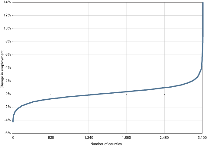
Source: IBRC “QCEW- Complete” and author's calculations
Empirical results
Two common industry components contributed to employment growth for both the top 620 (high performers) and the bottom 620 (at-risk). A sufficient share of business-related service industries appears to be a critical element in driving overall county economic growth. Traditional manufacturing industries on the other hand—industries such as upstream metal, plastics, automotive and heavy machinery—exert a headwind on employment growth. Interestingly, but not surprisingly, these are the two concentrations that matter most in the at-risk regions. What is surprising, however, is that scale, or population size, is only statistically significant in the high-performing regions and that the coefficient is negative, suggesting that the population scale is not necessarily a beneficial characteristic as is often thought.
Industry structure explains 13 percent of the variation of employment growth for the full 3,100 county sample (R-square = 0.13). Industry structure explains considerably less variation in the dependent variable for the at-risk counties, namely 5 percent (R-square = 0.05). This latter result may point to the high-growth counties driving the overall sample results and may point to the higher-performing regions as having similar and more balanced and diverse industry portfolios, in contrast to the at-risk regions that, typically, do not have a diverse industry make-up.
When analyzing occupational structure and concentration, only a few occupations in the “at-risk” regions are positive and significant, namely business and other white-collar occupations; technology and engineering occupations; and blue-collar production occupations. The latter was positive for only the at-risk 620. The blue-collar production set of occupations was negative and significant for the remaining sample and the top-performing 620—again pointing to traditional manufacturing being a drag on employment for most regions, with the at-risk regions being curious outliers.
The occupation results contrast the differences among the top, bottom and full sample regions in terms of “what we do” rather than the industrial “what we make” point of view. The telling story for the occupation results is that the R-square is greater for occupations than for industry structure, namely 20 percent for the full occupation sample.
The third and fourth analytical and data categories were innovation and social capital. Having higher innovation capacity, the presence of high social cohesion in a region and a can-do-spirit, are often touted as drivers of economic dynamism and performance. In the interest of space, the statistical associations of the innovation variables and social capital variables on employment growth are merely summarized. The explained variation for the full samples for innovation and social capital, 31 percent and 28 percent, respectively, exceeded both industry (13 percent) and occupational structure’s (20 percent) explained variation for the full sample. Yet, few of the coefficients of either set of variables—innovation or social capital—were statistically significant in the at-risk 620 group compared to either the full sample or the higher-performing 620. This may point to innovation being an important driver of regional development for successful regions—which may, in turn, bias the variable selection used to measure innovation. That is, the standard set of innovation measures and variables (such as the number of patents a region produces) is determined by the regions that are “innovative” and for which we have data, such as patent rates.
Productivity-enhancing innovation may occur in regions that underwent dramatic industrial change due to the decisions in corporate headquarters—to automate, for example—or it may occur in smaller, highly rural regions where the local producers adopted technologies developed elsewhere—high-yield seed varieties, for example—but neither of those activities would appear in any local or county-level data (as currently collected). Not all productivity-enhancing activities are measured. A walk in baseball may add runs to the team’s score, but doesn’t improve a player’s batting average.
If, indeed, there is variable selection bias rooted in survivorship bias, and if this bias potentially undercuts making sound assessments based on statistical relationships, how should a researcher proceed?
Visual analytics—Is a human eye better than statistics?
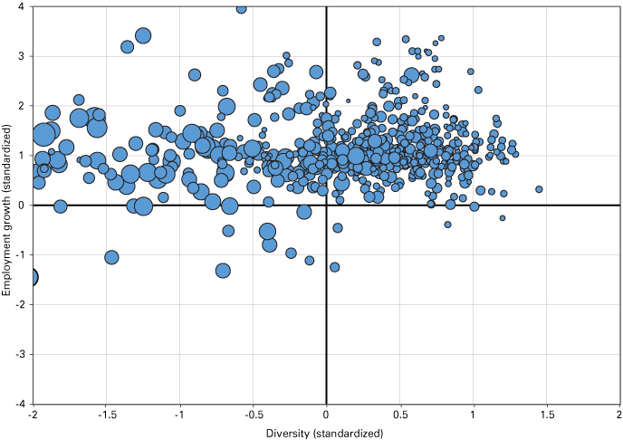
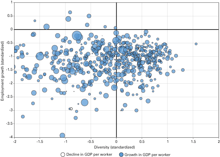
We explore the possibility that data visualization can help discern patterns and potentially draw statistical inferences regarding the forces of regional success or struggle. First, we cast all U.S. counties into four quadrants based on the two economic development objectives of employment growth and volatility/stability. That more industrially diverse regions are more economically stable is generally accepted (see Kluge, 2018). Here we measure diversity using the Shannon Entropy Index. Both employment growth (2001-2016 average annual rate) and the Shannon Index are standardized, allowing for consistent mapping, with employment growth on the vertical axis and the volatility measure (Shannon Index) on the horizontal axis, as shown in Figure 2.
Figure 2: Employment growth and volatility/diversity (all counties)
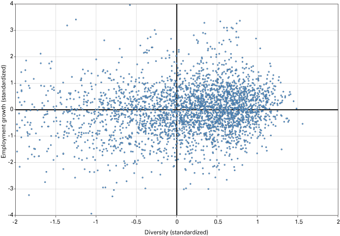
Source: BLS and author’s calculations
The northeast quadrant shows the regions that have relatively high employment growth and diversity. The southwest quadrant shows the regions that have negative employment growth and relatively low industry diversity. The data points, each representing a county, appear bunched together on the eastern side of the graph. This is partially due to the standardization process, but it also shows that there is something of a trade-off between growth and diversity. This trade-off may be referred to as the efficient frontier. As it happens, there is a long tail on the western side of the graph that is not shown; we maintain the same axes and scale—four units on the vertical and two on the horizontal—to provide consistency across the charts.
High-performing regions
Figure 3 plots the 620 top-performing regions as a bubble chart, with population size corresponding to bubble size. While the axes remain standardized values, the top 620 employment growth counties were selected based on actual employment growth from 2001 to 2016. All counties appear in the exact same location from one quad chart to the next. A county at -0.25 on the horizontal axis and 3 on the vertical axis—LaFayette County, MS, for example—will be in the same location on the quad chart even while the bubble size of that data point will change depending on the variable. The takeaway from Figure 3 is that counties in the northeast quadrant, generally speaking, tend to be much larger in population than the less diverse counties in the northwest quadrant.
Figure 3: Population quad chart (top 620 counties)
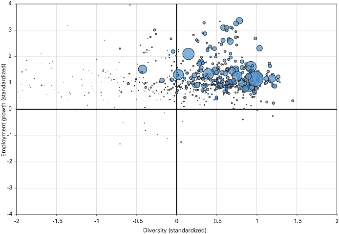
Source: BLS and Census
To show the mixed experience of the top-performing counties, we provide two more bubble charts of the top 620 for net migration and the share of employment attributed to government (local, state and federal). Net migration is the total number of a region’s inbound migrants minus the total number of outbound migrants divided by total population in the region.
Figure 4 shows that both diverse and less diverse counties have had positive and negative migration flows—negative is shown by empty bubbles—over the last five years, although, as a percent of the total population, net migration appears to be more salient in the less diverse and lower population counties.
Figure 4: Net migration quad chart (top 620 counties)
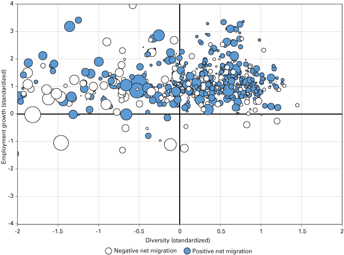
Source: BLS and Census
Figure 5 presents the share of county employment attributed to government workers. This representation is intuitive given that more diverse economies—greater number and more balanced industry profiles—would have relatively smaller shares of government employment. Less industrially diverse counties would tend to have a larger share of their employment attributed to government workers given the needs of a county’s government services—as well as the few counties with a large federal presence, such as a research laboratory. As one moves left/west along the horizontal axis, the bubbles tend to get larger.
Figure 5: Government employment share quad chart (top 620 counties)
Source: BLS and author’s calculations
At-risk regions
Now, our focus changes from the higher-performing regions to those in the left tail of the distribution in Figure 1. In the following figures, the vertical axis has been shifted up in order to provide more space in the southern/bottom half of the chart for the at-risk 620 counties to be depicted. The axes and scale are consistent for the remainder of the figures.
Figure 6, the quad chart for population, uses the same scale as Figure 3. Comparing the two charts, it shows that the counties on the efficient frontier (the northeast quadrant of Figure 3) are generally larger than those lagging in robust employment growth. Note, however, that the largest bubble in Figure 6 is Wayne County, Michigan, the home of Detroit, which suffered mightily during both the auto sector restructuring in the early aughts and, subsequently, the Great Recession. The southeast quadrant shows that counties with larger populations also tend to be more industrially diverse.
Figure 6: Population quad chart (at-risk counties)
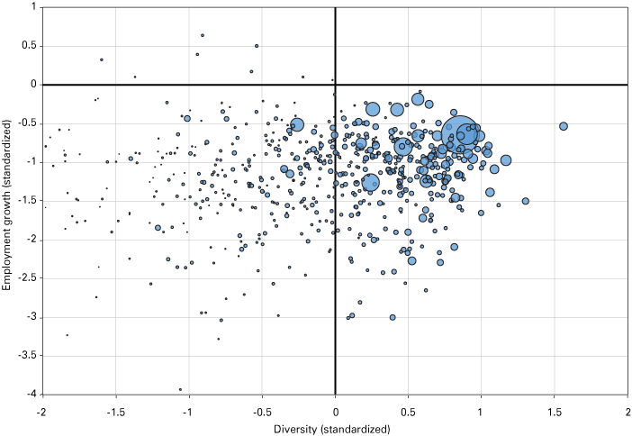
Source: BLS and Census
Figure 7 presents net migration data for the bottom 620 counties. Given that migration is measured as a percent of the region’s population, it makes sense that the less diverse and generally lower population counties would have the larger bubbles, both positive and negative. It does not seem to be the case that the poor employment situation in Detroit drove people away from the city over the last few years. This may reflect the fact that employment is a place of work measure, while migration is calculated based on place of residence. A large share of Detroit’s redundant auto workers may have lived outside of Wayne County.
Figure 7: Net migration quad chart (at-risk counties)
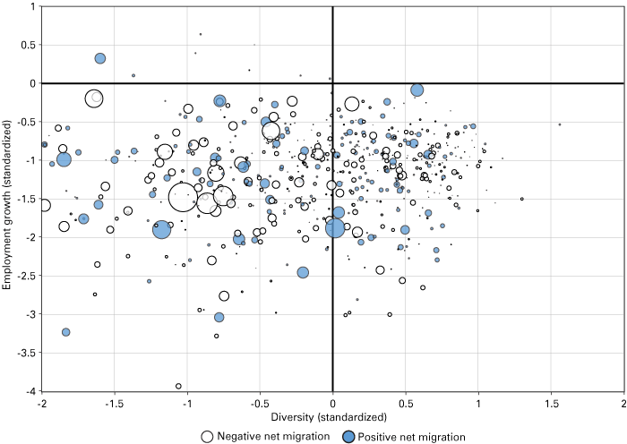
Source: BLS and Census
Figure 8 shows how industry share is represented between the poles of industry diversity and concentration. Many of the at-risk counties in the southwest quadrant of Figure 8 have a high concentration of employment in the production of consumer goods (or at least higher than the southeast quadrant), which exposes them to both greater potential for economic volatility because of being reliant upon a limited number of industries and the potential threat of the offshoring of jobs in industries like electronics, textiles and toys.
Figure 8: Consumer goods employment quad chart (at-risk counties)
Source: BLS
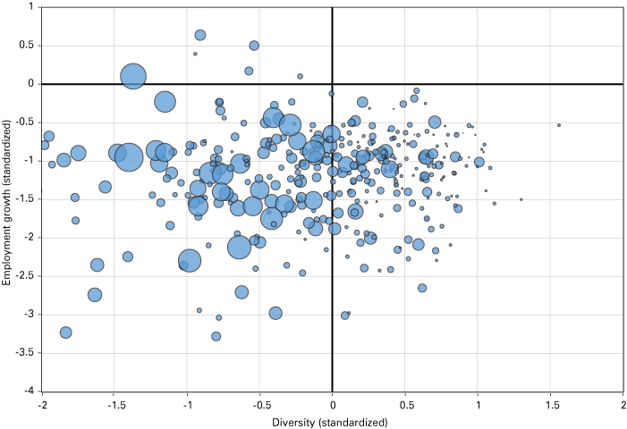
Figure 9 plots productivity per worker for the at-risk 620 counties. For this set of distressed counties, this graph may be the most encouraging. While one might surmise that the regions in the southwest quadrant may be in economic death spirals, this shows that worker productivity (as measured by GDP per worker) is relatively robust. These data may indicate that the counties undergoing dire circumstances with plant closings or other restructuring were able to find a new path. (Recall these employment data are for 2001 through 2016—a period of dramatic manufacturing restructuring with offshoring and automation.) There may have been a significant loss of jobs, but for those that remained employed, there were increases in productivity as measured by output per worker. It may also indicate potential counter-balancing trends. For example, higher-tech (and higher-paid distributed) workers may have moved to live closer to natural amenities.
Figure 9: Growth in GDP per worker quad chart (at-risk counties)
Source: BLS and author’s calculations
Figure 10 plots the share of shock-prone industries—commodity producers like oil, minerals or agricultural products that are susceptible to international price changes. Here again, there is evidence of the importance of a diverse industrial profile as there are larger bubbles in the southwest quadrant compared to the southeast, and it appears that the dispersion of larger versus smaller bubbles is a function of diversity. In short, greater industry diversity is associated with lower vulnerability to shock-prone industries. It may be that regions dependent on commodities like oil and gas or other minerals may do especially well when the times are good, but are particularly hard hit when the international economy slides or there is some other global event that can influence commodity prices.
Figure 10: Share of shock-prone industries quad chart (at-risk counties)
Source: BLS and author’s calculation
Finally, Figure 11 plots the business formation measure of establishment births to total regional establishments. In this chart, there is no indication that the low diversity and negative employment growth counties are lacking in entrepreneurial spirit. As one moves from right to left, the bubbles tend to become larger, showing that there are relatively high rates of start-ups. These firms may fail, and given the small denominator of total establishments in smaller counties, the number of new firms and the workers they hire is likely not large. That said, it would appear that the regions are starting businesses, even if those ventures may be motivated by the need to make a living (need-based entrepreneurship) rather than taking advantage of new market possibilities (known as opportunity-based entrepreneurship). These counties may be struggling, but they are not down and out.
Figure 11: Establishment births to total establishments quad chart (at-risk counties)
Source: BLS and Census
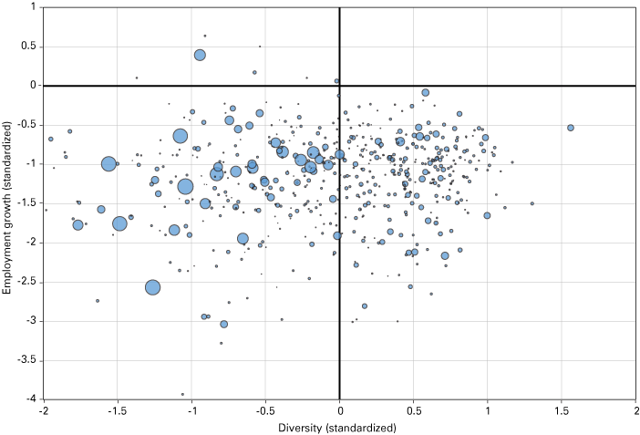
Discussion and conclusion
Each graphic tells a different story. Across the relatively limited number of dimensions presented, it is difficult to draw conclusions about them as a group. Another factor that is often considered for regional analysis is whether a county is in a metro area, adjacent to a metro area or a rural area. Proximity to a metro area is thought to confer economic benefits to neighboring rural counties. The takeaway from Figure 12 is that location—metro proximity—bears no distinct relationship with employment growth or volatility. There is no clear pattern of the solid dots (metro or metro-adjacent) or the empty circles (rural counties).
Figure 12: Rural versus metro or metro-adjacent quad chart (at-risk counties)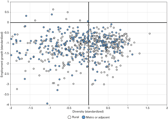
Source: BLS and the USDA Economic Research Service
One is left with the sense that the 620 at-risk counties of the U.S. present a difficult task for one interested in designing appropriate, well-targeted policy responses or development strategies for their particular context.
Statistical analysis can be helpful to recognize that the two tails of the employment growth rate by county behave differently. There is a trade-off between specialization-led faster employment growth and industry diversity that makes a region less vulnerable to shocks. This is shown by the arc-shaped cluster of regions forming the frontier in the northeast quadrant. There are few outliers with particularly strong employment growth and diversity. For the higher-performing northeast quadrant, the correlation between growth and diversity is close to zero (-0.02). On the other hand, there is a modest and positive correlation between growth and diversity in the at-risk regions (0.21). These divergent results are also in evidence for many of the independent variables used in the regression models.
Conventional statistical analysis did not yield helpful insights about regional characteristics associated with employment growth, at least with the data we had available. Thus, we took a visual analytic approach to discern patterns across regions. Another tactic would be to apply data science methods, such as machine learning and dimension reduction. The latter we employed for the industry and occupational analysis. Principal component analysis reduced the data dimensions, but the results were often anomalous combinations of occupations and/or industries, making interpretation, drawing conclusions and developing consistent strategies difficult.
The question remains: What policies will encourage growth in at-risk regions? We found that establishment expansions divided by contractions had a positive and significant association with employment growth for both the full sample and the 620 at-risk counties. On one level, this is instinctual: growing establishments (or firms) contribute to employment growth. That said, this finding, together with the finding that a prominent business services sector is associated with regional job growth, may provide economic development practitioners some guideposts for strategies to pursue and policies to enact—for example, to encourage business retention, enable infrastructure (such as broadband) and ensure there are businesses that complement a region’s established industrial competencies.
The strategies mentioned above are not particularly fresh. They could have been proposed by anyone familiar with the economic development field, whether one had survivorship bias or not. The important follow-up questions for the at-risk regions are: Does a policy make sense given the context, and is it feasible? Regions that succeed and those that have the financial resources for consultants set the agenda. No consultant or researcher is going to be handsomely compensated by studying at-risk regions. Yet, developing precision policies for these struggling regions is something of a “moon shot”—not easy but hard. Researchers need to take deep analytical dives and invent unique solutions, not promote formulaic economic development strategies and policies that may only apply to regions that are already success stories.
If each region is different in its own way, as we have argued, then there is a need to do analysis case by regional case.
Given the financial and analytical constraints of conducting a case study for an at-risk region, speed and efficiency are paramount. Begin with an end in mind. What policy levers are available and feasible for this particular region? What available indicators would be relevant to monitoring the effects of policy on these interventions? What resources and competencies are there in the region? Dive deeply into the data and history of a region to determine if the performance outcomes were a result of good planning or serendipity. If, during the analysis, the researcher or consultant keeps saying something to the effect of, “What? I’ve never seen this before,” she or he may be on to something. The deep dive will likely be surprising.
This article was prepared by the Trustees of Indiana University using Federal funds under award number ED17HDQ3120040 from the U.S. Economic Development Administration, U.S. Department of Commerce. The statements, findings, conclusions, and recommendations are those of the author(s) and do not necessarily reflect the views of the Economic Development Administration or the U.S. Department of Commerce.
Notes
- Documentation about these data and their sources can be found in the reports available at www.statsamerica.org/ii2/reports/Default.aspx.
References
- Feser, E. J. (2003). What regions do rather than make: A proposed set of knowledge-based occupation clusters. Urban Studies, 40(10), 1937-1958.
- Florida, R. (2014). The rise of the creative class—revisited: Revised and expanded. New York: Basic Books.
- Kluge, J. (2018). Sectoral diversification as insurance against economic instability. Journal of Regional Science, 58(1), 204-223.
- Porter, M. E. (1998). Clusters and the new economics of competition. Harvard Business Review, 76(6), 77-90.
- Thompson, W., & Thompson, P. (1993). Cross-hairs targeting for industries and occupations. In D. L. Barkley (Ed.), Economic adaptation: Alternatives for nonmetropolitan areas (pp.265-286). Boulder: Westview Press.
