
Migration Trends and Population Change Between the Censuses
Demographer, Indiana Business Research Center, Indiana University Kelley School of Business
Data from the 2010 Census show that Indiana added more than 400,000 residents in the last 10 years to reach a total population of 6.48 million. Indiana's 6.6 percent growth rate far outpaced neighboring Illinois, Michigan and Ohio. Furthermore, 63 of Indiana's 92 counties posted a population increase over the same period.
On the face of it, these are encouraging numbers, yet they mask some troubling trends. Namely, two-thirds of Indiana's counties had a net out-migration of residents over the decade. In many counties, these losses were offset by the natural increase of the population (i.e., more births than deaths) but not in all. Statewide, Indiana did have a net in-migration of residents last decade but the final tally was well below the level during the 1990s.
While data on total population changes are important for a variety of reasons, they do not always provide a clean indicator of how populations respond to the current conditions on the ground. Migration numbers, on the other hand, offer a more representative measure of a local area's vitality. These numbers are akin to a referendum on the economic or quality of life conditions in a given community. This article will examine Indiana's population shifts by the different components of change, with an emphasis on migration. Later, there will be a focus on Indiana's migration patterns by age and the geographic distribution of migrants to and from the state. Finally, we will look at trends in a handful of counties to examine the primary drivers of migration in different areas of the state.
Population Change across the State
Any discussion of Indiana's population growth over the past decade must start with the Indianapolis-Carmel metro area. The 10-county region1 fueled much of Indiana's population growth over the past decade, adding 231,137 people—a 15.2 percent increase. This region accounted for 57 percent of the state's total growth. This rapid growth means that the state's population is becoming increasingly concentrated in central Indiana. The 10-county metro area's share of the state population increased from 25.1 percent in 2000 to 27.1 percent in 2010.
Indiana's other large metropolitan statistical areas—Gary, Fort Wayne, Evansville and South Bend—also grew but only Fort Wayne outpaced the state's mark of 6.6 percent growth over the decade.
Meanwhile, many of the mid-sized communities that long formed much of Indiana's industrial backbone saw significant population decline. This is particularly the case through a swath of north-central and east-central Indiana where metropolitan and micropolitan areas such as Logansport (-4.8 percent), Wabash (-5.9 percent), Kokomo (-2.8 percent), Marion (-4.6 percent), Anderson (-1.3 percent), Muncie (-0.9 percent), Richmond (-3.1 percent) and Connersville (-5.1 percent) lost population.
In all, 63 Indiana counties added residents over the last decade while 29 lost population (see Figure 1). Blackford County (-9.1 percent), Benton County (-6.0 percent) and Wabash County (-5.9 percent) had the sharpest declines of all Indiana counties. The 29 counties with shrinking populations combined to lose 27,947 residents over this period.
Figure 1: Indiana Population Change by County, 2000 to 2010
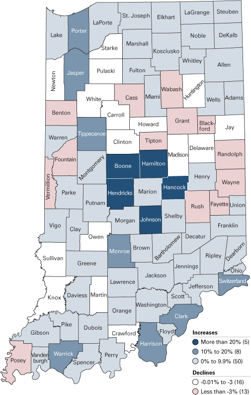
Source: IBRC, using U.S. Census Bureau data
Meanwhile, the state's five fastest-growing counties all bordered Marion County. These ring counties were led by Hamilton and Hendricks, which grew by 50 percent (91,829 residents) and 40 percent (41,355), respectively.
Indiana's largest counties are growing, too. Marion County added 42,939 residents to reach a total population of 903,393—a 5 percent increase. In Northwest Indiana, Lake County is up 2.4 percent to 496,005 residents, while neighboring Porter County grew by 12 percent to reach 164,343. Allen County grew by 7.1 percent to climb to 355,329 residents.
While industrial decline may have led to population loss in many parts of the state, two metro areas that are heavily focused on manufacturing saw strong growth. Elkhart County, despite being hit hard by both recessions in this decade, posted an 8.1 percent population growth, while Bartholomew County grew by 7.5 percent.
Components of Indiana's Population Change
Populations grow or contract through natural increase (the difference between the number of births and deaths) and migration. Over the last decade, Indiana had roughly 320,000 more births than deaths, which accounted for 80 percent of the state's total population growth. All but five Indiana counties (Vermillion, Henry, Sullivan, Brown and Wabash) registered a positive natural increase over the last decade.
Net in-migration as a source of population growth was not nearly as widespread. Only 30 of Indiana's 92 counties added population, on net, through migration over the last decade.2 Recall that 63 counties notched population gains over this period, which means that the natural increase in 33 counties was large enough to offset a net out-migration of residents.
As with population growth in general, suburban counties in the Indianapolis metro area had the greatest levels of net in-migration (see Figure 2). Hamilton County had the state's largest positive net migration at roughly 65,000 residents over the decade. This figure was twice as great as second-place Hendricks County, which had a net in-migration of 32,000 residents. Hamilton and Hendricks counties' migration numbers equate to a migration rate per 100 residents of 35.7 and 31.0, respectively. Rounding out the state's five highest migration rates were the fellow Indianapolis metro communities of Hancock County (19.5 per 100 residents), Boone County (17.2) and Johnson County (14.7).
Figure 2: Net Migration Rates per 100 Residents by County, 2000 to 2010
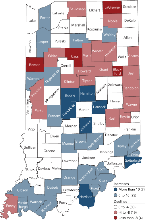
Source: Indiana Business Research Center
Suburban counties elsewhere in the state also showed high rates of in-migration. Harrison (10.5) and Clark (9.9) counties in the Louisville metro area had high rates of net in-migration as did Warrick County (10.0) in the Evansville area and Porter County (7.3) in Northwest Indiana. In the southeast corner of the state, rural Switzerland County (14.5) and Ohio County (6.6) also had high marks.
Net out-migration over the last decade, however, was widespread in the northern half of the state. In fact, excluding counties in the Indianapolis metro area, only six of the 46 Indiana counties north of Interstate 70 (or intersected by it) had net in-migration over the last 10 years. Blackford, Benton, Cass and LaGrange counties each had net out-migration rates above 8 residents per 100.
Marion County had the largest absolute net outflow of population over the decade at roughly 30,500 residents followed by St. Joseph County (-13,000) and Lake County (-10,900).
On whole, Indiana posted a net in-migration of 80,000 residents between 2000 and 2010. This marks the second consecutive decade that migration has made a positive contribution to the state's population growth. Indiana had a net in-migration of more than 200,000 residents during the 1990s, according to data from Moody's Economy.com.
Behind the Numbers
These migration figures raise a lot of questions. Who is moving? Where are they going to or coming from and why? A look at migration rates by age helps to answer the "who" question. As Figure 3 shows, the state had high rates of net in-migration in the 5-to-19 and the 35-to-44 age groups, suggesting that Indiana was an attractive destination for younger families in the last decade. A strong net inflow of college students also helped to boost the migration rates for the 15-to-24 age group. According to the National Center for Education Statistics, Indiana regularly ranks among the top states for net migration of college freshman. Indiana ranked eighth in this measure in 2008 with a net inflow of more than 8,000 students.
Figure 3: Indiana Net Migration Rates by Age, 2000 to 2010
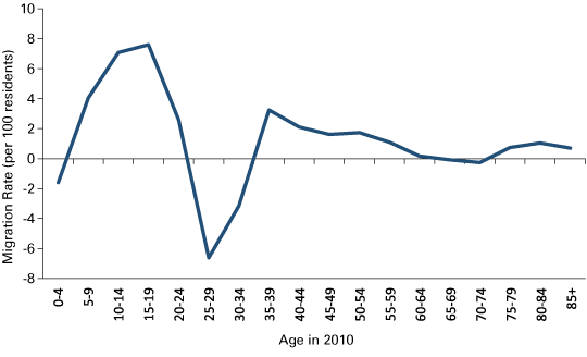
Source: Indiana Business Research Center
On the other side of the coin, Indiana lost large numbers of young adults over the last decade. On net, members of the 25-to-29 age group left the state over the decade at a rate of nearly seven residents per 100. The net outflow in the 30-to-34 age group was also strong.
The rate of net migration tapers off with age. Indiana remained a net in-migration state for the population between the ages of 45 and 64, but at ever-lower rates with each successive age group. There was a slight net outflow of residents in the 65 to 74 age groups yet the state returned to net in-migration for the 75 and older population.
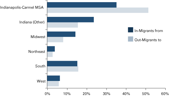
Data from the Internal Revenue Service on the movement of income taxpayers shows that roughly 19 percent of in-migrants to the state in recent years came from Illinois (see Figure 4). This mark was more than two-times greater than for any other state. In all, 44 percent of migrants to Indiana came from Illinois, Ohio, Kentucky or Michigan. As for broad geographic regions, 43 percent of the state's in-migrants came from the Midwest compared to 35 percent from the South, 12 percent from the West and 6 percent from the Northeast.3
Figure 4: Migration to and from Indiana by Region, 2001 to 2008
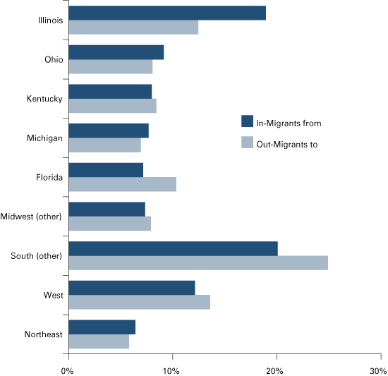
Note: Data are unavailable for 2004
Source: IBRC, using Internal Revenue Service data
Illinois was also the largest recipient of migrants from Indiana between 2001 and 2008, but the south was the top destination region. With 10 percent of Indiana migrants headed to the Sunshine State, Florida was the second-largest destination of Indiana migrants. All other Southern states combined to claim another 33 percent of Indiana out-migrants to bring the South's total to 43 percent. Another 35 percent of Indiana migrants stayed in the Midwest.
Pinpointing why people move—or why migration patterns change—is trickier. Migration is a volatile process that is triggered by a variety of factors. Housing and lifestyle decisions tend to be the dominant drivers of migration trends in many regions while others are affected more by employment-related considerations. A look at migration patterns in a few local areas helps to illustrate these different factors.
Indiana's Large Metro Areas
According to the latest Current Population Survey from the Census Bureau, more than 70 percent of people that make short-distance moves (i.e., less than 50 miles) across county lines in the U.S. do so for either housing or family-related reasons. These factors certainly drive migration trends within Indiana's largest metro areas.
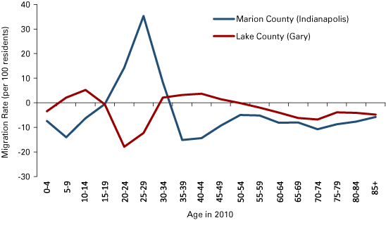
As seen earlier, Marion County had the state's largest net out-migration in the last decade and Lake County had the third-largest net outflow. Figure 5 presents the migration patterns by age for these two. Marion County is a popular destination for young adults, yet families leave the county in large numbers too. Marion County also had a consistent net outflow of older adults and retirement age residents.
Figure 5: Marion County and Lake County Net Migration Rates by Age, 2000 to 2010
Source: Indiana Business Research Center
Lake County is unique in that it has the migration characteristics of both an urban core county and suburban community. Like many suburban areas, the county had a net inflow of families last decade. However, these gains were overwhelmed by the large loss of young adults and a steady outflow of residents over the age of 50.
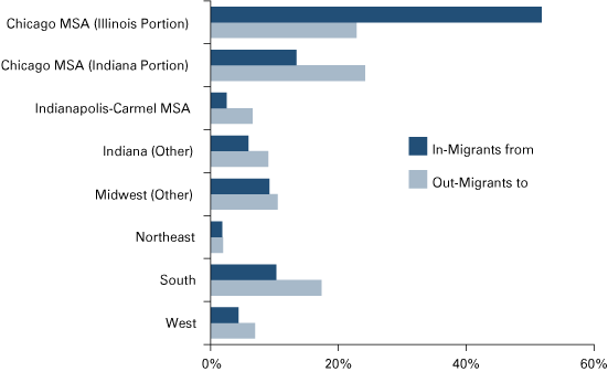
As Figure 6 and Figure 7 show, neighboring counties were the largest recipients of migrants from these urban areas. Between 2001 and 2008, more than half of all migrants from Marion County settled elsewhere in the greater Indianapolis-Carmel metro area, according to the IRS data. Another 15 percent moved somewhere else in the state. Interestingly, migrants from Marion County were twice as likely to move to the South (16 percent of total migrants) than another Midwestern state (8 percent).
Figure 6: Migration to and from Marion County by Region, 2001 to 2008
Note: Data are unavailable for 2004
Source: IBRC, using Internal Revenue Service data
Figure 7: Migration to and from Lake County by Region, 2001 to 2008
Note: Data are unavailable for 2004
Source: IBRC, using Internal Revenue Service data
Migrants from Chicago are most likely responsible for the influx of families to Lake County. The Illinois portion of the Chicago MSA contributed more than half of all migrants to Lake County between 2001 and 2008. Another 13 percent of migrants to Lake County came from the Indiana portion of the Chicago metro (i.e., Jasper, Newton and Porter counties). As for migrants leaving Lake County, 24 percent moved within the Indiana part of the Chicago MSA while 23 percent crossed the state line but stayed in the greater metro area. Another 17 percent of Lake County migrants headed to the South and 10 percent relocated elsewhere in the Midwest.
Figure 8 provides a few examples of how the outflow from large urban areas impact Indiana's high in-migration counties. Hendricks County—like other central-Indiana suburban communities—saw a major influx of children and residents in the 30-to-44 age group. Hendricks County also had a consistently strong in-migration of residents age 45 and older. The migration signatures for Porter and Harrison County are similar, although not as dramatic. More than half of the migrants to these counties between 2001 and 2008 came from another county in their respective metro areas.
Figure 8: Net Migration Rates by Age for Select High-Growth Suburban Counties, 2000 to 2010
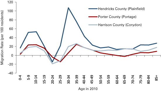
Source: Indiana Business Research Center
Given these urban to suburban flows, it should be no surprise that Indiana's total net migration figures receive a big boost from the three large metro areas on its border. Between 2001 and 2008, the IRS data show that the number of Indiana in-migrants from the Illinois portion of the Chicago MSA outnumbered the state's total migration to this area by a ratio of nearly 2-to-1. Indiana also had a lopsided migration exchange with the Louisville and Cincinnati metro areas. All told, the seven years of IRS data show a net inflow of 52,000 residents to the state from these areas. Without this influx, Indiana would have had a much lower-level net in-migration last decade.
The Impact of Job Losses
Employment decisions also play an important role in migration patterns. The 2010 Current Population Survey indicates that 18 percent of short-distance moves are initiated by employment decisions. This figure is closer to 40 percent for long-distance moves of 200 miles or more.
Additionally, over the last two decades, shifts in Indiana employment change from year-to-year-whether positive or negative-have typically signaled a similar turn in the state's annual net migration levels.4 Unfortunately, Indiana's economy has struggled over the past decade. For instance, the state added more than 450,000 payroll jobs during the 1990s, with 54,000 of these new positions in manufacturing. By contrast, Indiana shed 225,000 jobs overall in the last decade and lost nearly 216,000 jobs in manufacturing alone. More than half of these manufacturing losses came before the most recent recession hit in late 2007. This turnabout in the employment trend is likely one key reason why Indiana's net in-migration mark last decade was far lower than during the 1990s.
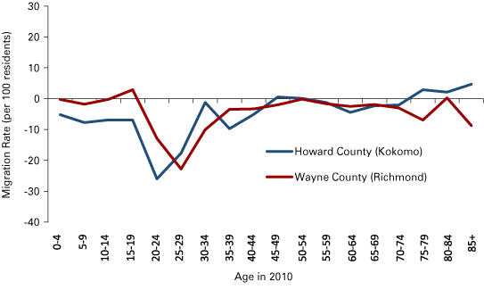
These job losses have hit many areas of northern and east-central Indiana particularly hard. As a result, these regions are home to many of the Indiana counties with net out-migration and population decline over the decade. Although many other communities have had a similar experience, we will look at two counties—Howard and Wayne—to get a sense of the typical migration trends in these areas. Like 32 other counties around the state, these two counties saw their manufacturing employment slide by more than 40 percent over the last decade. Additionally, they both lost population and had a net outflow of residents.
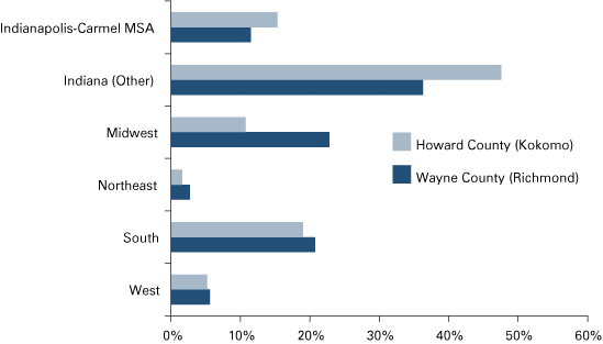
As Figure 9 shows, both Howard and Wayne had a net out-migration of residents at nearly every age group, with particularly sharp outflows between the ages of 20 to 29. The most likely destination for migrants leaving Howard County in recent years was Miami County (its neighbor to the north) followed by Hamilton and Marion counties in the Indianapolis metro area. In all, more than 60 percent of Howard County's out-migrants stayed in Indiana (see Figure 10).
Figure 9: Net Migration Rates by Age for Select Out-Migration Counties, 2000 to 2010
Source: Indiana Business Research Center
Marion County was the most common destination for migrants moving from Wayne County, followed by neighboring Randolph, Preble (Ohio), Fayette and Henry counties. These top five counties claimed a little more than 20 percent of Wayne County's out-migrants between 2001 and 2008.
Figure 10: Destination of Migrants from Howard County and Wayne County, 2001 to 2008
Note: Data are unavailable for 2004
Source: IBRC, using Internal Revenue Service data
Conclusion
These differing migration trends will have important implications for the state if they continue. For instance, Indiana had the pleasant distinction of being one of only a handful of states in the Midwest or Northeast to see its population under the age of 17 increase between 2000 and 2010. However, all of this growth occurred in just 24 counties. Meanwhile, the child population declined by 5 percent or more in roughly half of Indiana counties. So, large areas of the Indiana are aging rapidly due, in part, to out-migration while families are concentrating more and more in a few distinct regions of the state.
Just because this was the experience in the last decade, however, does not mean it has to continue into the next one. Some factors that drive population change can shift quickly. During the 1990s, for example, only 11 Indiana counties lost population and none lost more than 900 residents. In contrast, 29 counties saw their population decline in the last decade and 11 counties lost more than 1,000 residents. Looking back even further, Indiana experienced high levels of out-migration during the 1980s but the tide reversed sharply in the following decade. So while these trends can change, many parts of the state will likely need to see a turn in economic performance before they do.
About the Data
For this article, two different methods were used to estimate net migration. Total net migration estimates were calculated using a residual method. In this approach, net migration is the difference between the total natural increase in a given area between the 2000 and 2010 census and the total population change over the same period. If the population change exceeds the natural increase, for instance, then the difference is net in-migration. The natural increase estimates covering April 1, 2000 to June 30, 2009 come from the Census Bureau's annual population estimates program. These estimates are based on birth and death data collected directly from the Indiana State Department of Health (ISDH). IBRC analysts estimated natural increase for an additional nine months to cover the full census period.
Age-specific migration rate estimates were calculated using a survival rate method. Under this approach, age-specific 10-year survival rates are applied to the Census 2000 population counts to estimate an expected population for each age group in 2010. These expected population numbers approximate what the 2010 population would be in a given cohort if there was no migration over the 10-year period and deaths were the only source of population change. The difference between the expected population and the actual 2010 Census count becomes the net migration estimate. State and county-specific life table survival rates were calculated using mortality data from ISDH and population figures from the Census Bureau.
Data on the destination of migrants comes from the Internal Revenue Service. These data are limited in that they cover only the migration of income tax filers and their dependents. To be counted as a migrant, a worker must file a return in two consecutive years and indicate a different resident county in each. This means the data can miss the movement of many college students or young workers, retirees, immigrants or workers that do not file returns. That said, this is some of the best data available for examining annual migration trends and the destination of movers. The data in this article cover each year between 2001 and 2008 with the exception of 2004, which is unavailable.
Notes
- The Indianapolis-Carmel MSA includes Boone, Brown, Hamilton, Hancock, Hendricks, Johnson, Marion, Morgan, Putnam and Shelby counties.
- For county-level migration estimates, the populations at state and federal adult correctional facilities were removed from total population numbers since these residents do not move voluntarily. This adjustment shifted Henry, Jefferson, Perry and Vigo counties from net in-migration to net out-migration counties.
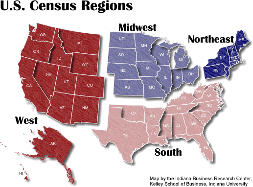
- The U.S. Census Bureau's regional definitions were used for this analysis.
See a map of these Census regions at www.stats.indiana.edu/maptools/maps/boundary/census_regions_main.gif. - Matt Kinghorn, “Population and Employment Change in Indiana,” InContext, July-August 2009, www.incontext.indiana.edu/2009/jul-aug/article1.asp.
Also in this Issue…

