
County Population Estimates for 2007: Interpreting the Components of Change
President, Thompson Analytics, LLC
The Census Bureau’s latest county population estimates paint an informative picture of population growth since Census 2000. As always, some counties gained population, some lost, and some didn’t change much. It is important for us to look at changes in total county population, but some of the more interesting results won’t be revealed until we dig a little deeper and examine the components of change.
The Tall and Short of It
Table 1 lists the twenty most and twenty least populated counties in Indiana, according to the Census Bureau’s estimates for July 1, 2007. The top twenty counties account for 4.14 million people, or 65.3 percent of the state’s estimated 6.35 million residents. Those same twenty counties only accounted for 64.3 percent of the state population as of Census 2000. That’s an increase of one full percentage point for the seven-and-one-quarter year period. In contrast, the bottom twenty dipped slightly from 276,342 to 271,489 people; that is, from 4.5 percent to a 4.3 percent share of the state’s population.
Table 1: Twenty Largest and Smallest Counties, 2007
| Rank, 2007 Population Estimate | Change in Rank Since 2000* | County | 2007 Population Estimate | Numeric Change Since 2000 | Percent Change Since 2000 |
| 1 | 0 | Marion | 876,804 | 16,350 | 1.9 |
| 2 | 0 | Lake | 492,104 | 7,540 | 1.6 |
| 3 | 0 | Allen | 349,488 | 17,639 | 5.3 |
| 4 | 0 | St. Joseph | 266,088 | 529 | 0.2 |
| 5 | +1 | Hamilton | 261,661 | 78,921 | 43.2 |
| 6 | -1 | Elkhart | 197,942 | 15,151 | 8.3 |
| 7 | 0 | Vanderburgh | 174,425 | 2,499 | 1.5 |
| 8 | 0 | Tippecanoe | 163,364 | 14,409 | 9.7 |
| 9 | 0 | Porter | 160,578 | 13,780 | 9.4 |
| 10 | +3 | Johnson | 135,951 | 20,742 | 18.0 |
| 11 | +5 | Hendricks | 134,558 | 30,465 | 29.3 |
| 12 | -2 | Madison | 131,312 | -2,046 | -1.5 |
| 13 | -2 | Monroe | 128,643 | 8,080 | 6.7 |
| 14 | -2 | Delaware | 115,419 | -3,350 | -2.8 |
| 15 | -1 | LaPorte | 109,787 | -319 | -0.3 |
| 16 | +1 | Clark | 105,035 | 8,569 | 8.9 |
| 17 | -2 | Vigo | 104,915 | -933 | -0.9 |
| 18 | 0 | Howard | 83,776 | -1,188 | -1.4 |
| 19 | 0 | Kosciusko | 76,115 | 2,058 | 2.8 |
| 20 | +1 | Bartholomew | 74,750 | 3,315 | 4.6 |
| 73 | 0 | Carroll | 19,987 | -178 | -0.9 |
| 74 | 0 | Orange | 19,607 | 301 | 1.6 |
| 75 | 0 | Perry | 18,916 | 17 | 0.1 |
| 76 | 0 | Rush | 17,494 | -767 | -4.2 |
| 77 | +1 | Parke | 17,169 | -71 | -0.4 |
| 78 | -1 | Fountain | 17,143 | -812 | -4.5 |
| 79 | 0 | Vermillion | 16,417 | -371 | -2.2 |
| 80 | 0 | Tipton | 16,069 | -508 | -3.1 |
| 81 | 0 | Brown | 14,670 | -287 | -1.9 |
| 82 | 0 | Newton | 14,014 | -552 | -3.8 |
| 83 | +1 | Pulaski | 13,778 | 23 | 0.2 |
| 84 | -1 | Blackford | 13,189 | -859 | -6.1 |
| 85 | 0 | Pike | 12,605 | -231 | -1.8 |
| 86 | 0 | Crawford | 10,782 | 39 | 0.4 |
| 87 | 0 | Martin | 10,058 | -311 | -3.0 |
| 88 | +1 | Switzerland | 9,684 | 619 | 6.8 |
| 89 | -1 | Benton | 8,810 | -611 | -6.5 |
| 90 | 0 | Warren | 8,482 | 63 | 0.7 |
| 91 | 0 | Union | 7,203 | -146 | -2.0 |
| 92 | 0 | Ohio | 5,772 | 149 | 2.6 |
Source: U.S. Census Bureau
Looking at the changes in rank, we can see that the bottom twenty have remained relatively stable, while the top twenty have seen a good deal of movement. Notably, Hamilton County has overtaken Elkhart County at fifth place, and is on pace to overtake St. Joseph County at fourth place before Census 2010. Also, Johnson and Hendricks counties have both surpassed several other counties to fill the tenth and eleventh spots, respectively. It seems likely that Hendricks County will join the top ten soon.
Marion County, Indiana’s largest county and home to Indianapolis, also makes a showing in the Census Bureau’s list of 100 largest U.S. counties, placing fifty-fifth. That is a decline of five places since Census 2000, when Marion County ranked fiftieth.
To Gain or Not to Gain
Table 2 ranks the top and bottom five counties by numeric change. Hamilton County heads this list with a gain of almost 79,000 residents from April 2000 to July 2007. Although Marion County made fifth place, its growth in percentage terms ranked only thirty-seventh in the state.
Table 2: Top and Bottom Five Counties Ranked by Numeric Change, 2000 to 2007
| Rank, Numeric Change | County | Numeric Change |
| 1 | Hamilton | 78,921 |
| 2 | Hendricks | 30,465 |
| 3 | Johnson | 20,742 |
| 4 | Allen | 17,639 |
| 5 | Marion | 16,350 |
| 88 | Wabash | -2,042 |
| 89 | Madison | -2,046 |
| 90 | Wayne | -2,837 |
| 91 | Delaware | -3,350 |
| 92 | Grant | -4,556 |
Source: U.S. Census Bureau
Grant County sustained the greatest numeric loss of population. All of the bottom five counties have struggled with manufacturing employment losses over the period, especially Madison, Delaware, and Grant counties.
Of the top five numeric gainers, Hamilton, Hendricks, and Johnson counties also made the top five list for percent change, as shown in Table 3. All of the top five percentage gainers are “donut” counties surrounding Marion County. Two of these counties also made the Census Bureau’s list of the 100 fastest growing counties across the nation: Hamilton (twenty-third) and Hendricks (eighty-fifth).
Table 3: Top and Bottom Five Counties Ranked by Percent Change, 2000 to 2007
| Rank, Percent Change | County | Percent Change |
| 1 | Hamilton | 43.2 |
| 2 | Hendricks | 29.3 |
| 3 | Hancock | 19.7 |
| 4 | Johnson | 18.0 |
| 5 | Boone | 17.4 |
| 88 | White | -5.7 |
| 89 | Wabash | -5.8 |
| 90 | Blackford | -6.1 |
| 91 | Grant | -6.2 |
| 92 | Benton | -6.5 |
Source: U.S. Census Bureau
Two of the counties among the five having the greatest percentage loss, Grant and Wabash, were also among the five with the greatest numeric loss. Although Benton County takes last place here, that county is very small, so the magnitude of change was not very great; Benton County’s 6.5 percent decrease corresponds to a loss of 611 residents, while Grant County’s 6.2 percent decrease came with a loss of 4,556 residents.
To assess the magnitude of population growth, Figure 1 provides a scatterplot of percent change versus numeric change. Each of Indiana’s ninety-two counties is represented by its own data point. Points that are well away from the scatterplot’s “center of mass” are labeled individually. This allows us to quickly identify the counties that had the most momentum over the period. Immediately we see Hamilton and Hendricks counties have the most growth momentum, far exceeding other counties in terms of both percent and numeric change. We can also quickly determine that Grant County has the most negative momentum. Furthermore, this approach helps distinguish from the rest of the pack a few of the counties that didn’t make the top or bottom five lists.
Figure 1: Percent Change vs. Numeric Change, 2000 to 2007
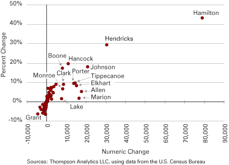
Sources: Thompson Analytics LLC, using data from the U.S. Census Bureau
The Inevitable: Births and Deaths
Obviously, the number of births and deaths in a county is heavily influenced by the county’s number of residents. So, when we look at Table 4 and discover the top five counties ranked by natural increase are also among the top six ranked by population (shown in Table 1), we are not surprised. What, however, explains why the rankings in the two tables aren’t the same? Primarily, it’s because each county has a different age distribution. All else held constant, counties that have a higher proportion of older residents will have a smaller natural increase, because there will be more deaths and fewer births compared to those of a county of the same population but younger age distribution. This partially explains why, for example, Lake County is ranked second by population but only fourth by natural increase. Lake County’s estimated median age in 2006 (the most recent estimate available) was 37.0, whereas it was only 35.4 for Allen County and 33.9 for Hamilton County. Similarly, Elkhart County edged out St. Joseph County to make the top five in part because its median age in 2006 was only 33.9, whereas St. Joseph’s was 35.7. Of course, differing fertility and mortality rates play a role as well.
Table 4: Top and Bottom Five Counties Ranked by Natural Increase, 2000 to 2007
| Rank, Natural Increase | County | Natural Increase | Births | Deaths |
| 1 | Marion | 51,025 | 105,567 | 54,542 |
| 2 | Allen | 19,288 | 38,350 | 19,062 |
| 3 | Hamilton | 19,069 | 26,381 | 7,312 |
| 4 | Lake | 15,852 | 50,492 | 34,640 |
| 5 | Elkhart | 13,573 | 23,826 | 10,253 |
| 88 | Brown | -12 | 937 | 949 |
| 89 | Knox | -23 | 3,277 | 3,300 |
| 90 | Henry | -35 | 4,056 | 4,091 |
| 91 | Sullivan | -85 | 1,753 | 1,838 |
| 92 | Vermillion | -179 | 1,454 | 1,633 |
Source: U.S. Census Bureau
As for the bottom five counties in Table 4, which are the only Hoosier counties having more deaths than births during the period, three are among Indiana’s counties having a very high estimated median age in 2006. Brown County has the oldest age distribution with a median age of 42.8, and Henry County ranks second at 41.0. Vermillion County, which has the greatest natural decrease, ranks ninth in median age at 40.2. Knox County’s median age is pulled down to 38.1 by the college-aged population attending Vincennes University. Sullivan County’s median age isn’t far off at 37.7.
Knox and Sullivan counties, however, both have relatively low fertility rates, ranking sixtieth and seventy-first, respectively, according to Indiana State Department of Health data for 2005 (the most recent data available at the time of this writing).1 Also notable is that Brown County had the lowest fertility of all Indiana counties in 2005, at a rate nearly half that of the state’s. Brown County also has a low mortality rate, ranking seventy-seventh in 2005. In contrast, the other four counties in the bottom five of Table 4 have some of the highest mortality rates. For 2005, Vermillion County had the third highest mortality rate, Henry County ranked fifth, Knox County twelfth, and Sullivan County eighteenth.
Influx and Outflux
The remaining components of population change involve migration, or people moving into or out of a county. Domestic migration happens when a migrant’s origin and destination are both within the United States, whereas for international migration, either the origin or destination is outside the nation. Net migration is merely equal to the “ins” minus the “outs” for a given geography. Total net migration is the sum of net domestic migration and net international migration.
Table 5 ranks the top and bottom five counties by total net migration from April 2000 to July 2007. For the third time in this article, Hamilton and Hendricks counties are ranked first and second, respectively (see also Tables 2 and 3). Marion County sits at the bottom of the list with a net outflow of over 31,000, more than three times that of ninety-first-ranked St. Joseph County. Also note that Marion County’s net domestic migration is more than 48,000—a key factor in the large inflows experienced by the surrounding “donut” counties, of which four are in the top five. Porter County, ranked fourth, picks up large gains from neighboring Lake County, ranked ninetieth.
Table 5: Top and Bottom Five Counties Ranked by Total Net Migration, 2000 to 2007
| Rank, Total Net Migration | County | Total Net Migration | Net International Migration | Net Domestic Migration |
| 1 | Hamilton | 55,047 | 2,080 | 52,967 |
| 2 | Hendricks | 24,818 | 491 | 24,327 |
| 3 | Johnson | 14,647 | 621 | 14,026 |
| 4 | Porter | 9,356 | 1,004 | 8,352 |
| 5 | Hancock | 8,431 | 37 | 8,394 |
| 88 | Delaware | -4,087 | 887 | -4,974 |
| 89 | Grant | -4,455 | 118 | -4,573 |
| 90 | Lake | -6,236 | 4,303 | -10,539 |
| 91 | St. Joseph | -8,666 | 4,371 | -13,037 |
| 92 | Marion | -31,235 | 17,222 | -48,457 |
Source: U.S. Census Bureau
Delaware and Grant counties, ranked eighty-eighth and eighty-ninth in Table 5, have struggled with declining manufacturing employment as previously mentioned. St. Joseph County also has lost some manufacturing jobs, and neighboring Elkhart County has been the destination for a large share of its domestic out-migrants. This makes some sense when you consider that St. Joseph County lost over 1,400 manufacturing jobs from 2001 to 2006, whereas Elkhart County gained about 8,700 manufacturing jobs over the same period.
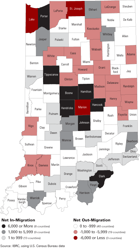
Figure 2 illustrates county migration levels across the state. Notice the “donut” counties are true to their name here, as five of the counties that border Marion County have a net in-migration of at least 6,000, and another exceeds 1,000. The map also gives us an idea of which counties are likely supplying migrants to adjacent counties.
Figure 2: Total Net Migration, 2000 to 2007
Reasons People Move
Why, indeed, do people move? The U.S. Census Bureau splits the reasons into four broad categories for the purposes of the Current Population Survey: family-related, employment-related, housing-related, and other. Each of these has more detailed subcategories. For example, employment-related reasons for moving are further broken down as follows: new job or job transfer, to look for work or lost job, to be closer to work/easier commute, retired, other job-related reason.
One of the results from the 2006 Annual Social and Economic Supplement to the Current Population Survey is those who moved within the same county are estimated to have moved for employment-related reasons only about 9 percent of the time, whereas the figure for intercounty movers is about 33 percent.2 These results have remained fairly stable over time.
Employment’s Influence on Migration
Given the fact that employment-related reasons often serve as the antecedent to a move, we have undertaken the task of measuring the relationship between employment and migration for Indiana’s ninety-two counties. First, we calculated over-the-year changes in employment for each county from 1999 to 2006 using Quarterly Census of Employment and Wages (QCEW) data from the Bureau of Labor Statistics. Since it often takes time for people to decide whether to move, and then even more time to make the move once decided, we relate each one-year change in county employment to the following year’s county net migration. To quantify this relationship, we calculated the simple correlation between them across all ninety-two counties. For each of the seven years examined, we calculated two separate correlations: one between change in employment and total net migration and another between change in employment and net domestic migration.
For those who aren’t statistically inclined, note that a correlation coefficient is a number between -1.00 and +1.00, where +1.00 indicates a perfect positive linear relationship (i.e., a straight line with positive slope intersecting all data points), and -1.00 indicates a perfect inverse linear relationship (i.e., a straight line with negative slope intersecting all data points). One nice thing about the correlation coefficient is if you square it, you get what we call R-square, which tells us the percentage of variation in the predicted variable (in our case, net migration) that is explained by variation in the predictor (for us, change in employment).
Table 6 provides a summary of the correlations. The table also provides over-the-year changes in employment for the whole state as a reference. With only two exceptions, the correlation between county-level change in employment and county-level total net migration is at least 0.65. For the most recent year, the correlation reached 0.74, the highest value over the period. This means that 55 percent of the variation in total net migration for 2006–07 was explained by the variation in change in employment for 2005–06. For 2005–06 total net migration the correlation is 0.67 and the R-square value is 0.44, or 44 percent. That value loosely compares to the 33 percent figure from the Current Population Survey mentioned above (a nationwide result).
| Employment Change Period | Indiana Over-the-Year Change in Employment* | Migration Period | Correlation with |
|
Total Net Migration |
Net Domestic Migration |
|||
| 2005–2006 | 18,624 | 2006–2007 | 0.74 | 0.63 |
| 2004–2005 | 24,922 | 2005–2006 | 0.67 | 0.49 |
| 2003–2004 | 26,994 | 2004–2005 | 0.31 | 0.14 |
| 2002–2003 | -10,674 | 2003–2004 | 0.73 | 0.76 |
| 2001–2002 | -38,683 | 2002–2003 | 0.65 | 0.77 |
| 2000–2001 | -63,268 | 2001–2002 | 0.65 | 0.77 |
| 1999–2000 | 28,687 | 2000–2001 | 0.25 | 0.03 |
*Census of Employment and Wages
Sources: Bureau of Labor Statistics and the U.S. Census Bureau; Calculations by Thompson Analytics LLC
An interesting finding is the difference in correlations for total net migration versus net domestic migration. Note that the correlation for net domestic migration is higher than that for total net migration in 2001–02, 2002–03 and 2003–04, whereas it was higher for total net migration in the other years. This seems to be a result of post-9/11 tightening of immigration policy, which served to increase the strength of the relationship between employment change and net domestic migration for three years. The highest correlation with net domestic migration, 0.77, came immediately following the terrorist attacks. The corresponding R-square value is about 60 percent.
What happened in the two years where the correlations are low? Note that those two periods are adjacent to the three consecutive years Indiana sustained over-the-year employment losses. In other words, the relationship did not hold for those two years due to the effects of a nearby peak or trough in employment. Specifically, the change in county employment over the 1999–2000 period didn’t produce as much migration as we might’ve expected in 2000–01 because the economy started to “head south” during that time (a recent peak). The relationship between 2003–04 changes in employment and 2004–05 net migration also failed to hold, probably because the citizenry were still “trying to get back on their feet” after struggling through three years of over-the-year employment losses (a recent trough). In other words, it seems likely that some who were willing to move for employment reasons during the 2004–05 period were financially unable to do so.
More Than Meets the Eye
The goal of this article was as much to stimulate thought and discussion about Indiana’s latest county population estimates as it was to call attention to compelling facts and figures. Hopefully the content will be of practical use to those who must take such things in consideration in their personal or professional decision making. Ultimately, however, the hope is that readers will come away with a heightened awareness that there is much more than meets the eye regarding the basic population estimates data.
Notes
- By the time this article is published, the Indiana State Department of Health will have released the 2006 births and deaths data. For total fertility rates go to www.in.gov/health/reports/natality/2006/toc.htm, select a year and look for Table 31. For mortality rates go to https://www.in.gov/health/reports/mortality/2007/highlights.htm.
- Source: U.S. Census Bureau, Current Population Survey, 2006 Annual Social and Economic Supplement, tables 34-1 and 34-2.
